22 ChatGPT Prompts to Create Different Types of Icons
Icons are everywhere in our digital lives. They help us navigate apps, identify functions, and communicate ideas instantly. Whether you’re a designer working on a new project or someone who needs custom icons for your website, ChatGPT can be your creative partner.
Head over to chatgpt.com and try any of the following prompts. I tested each one using a camera as the subject, so you can see how different styles affect the same object. Simply replace “camera” with whatever subject you need for your icon.
Each prompt is designed to produce a clean, usable icon that you can implement in your projects right away.
22 Icon Styles You Can Create
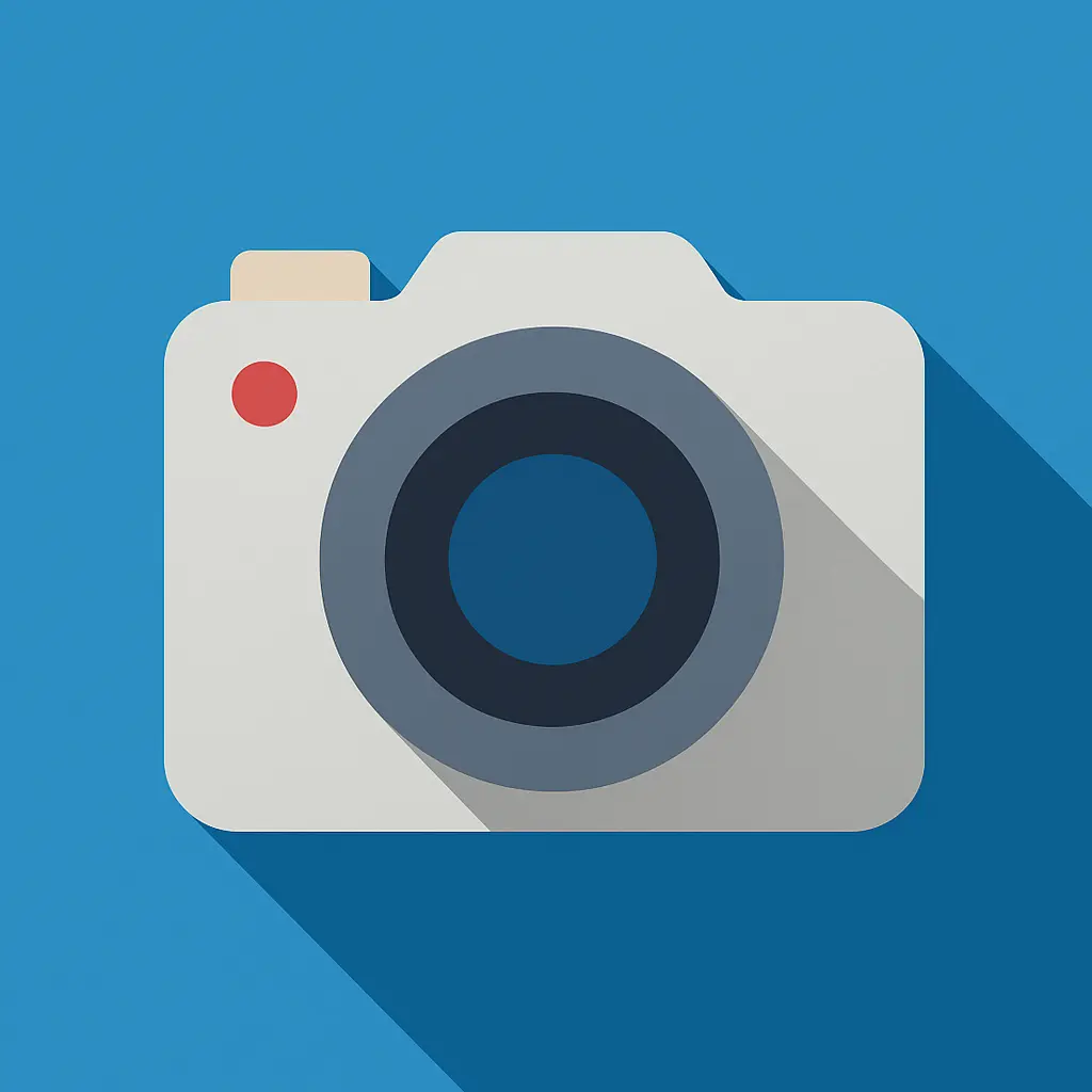
1. Flat Icon
Create a flat-style icon of a camera with simple shapes and bold colors, no gradients or shadows. Use a solid background and a 1:1 aspect ratio.
Flat icons work great for web interfaces and mobile apps. They’re simple, scalable, and never go out of style.
2. Line Icon
Create a clean line icon of a camera with thin, uniform strokes and no fill. Keep the background solid and the aspect ratio 1:1.
Line icons are perfect when you want something subtle that doesn’t compete with other design elements.
3. Solid Icon
Create a solid-style icon of a camera with bold, filled shapes and no outlines. Use a solid background and a 1:1 aspect ratio.
These icons make a strong visual statement and work well in high-contrast designs.
4. Minimalist Icon
Create a minimalist icon of a camera using very few lines and clean geometry. The background should be solid and the aspect ratio square (1:1).
Minimalist icons are great for premium brands and clean interfaces where simplicity is key.
5. Gradient Icon
Create a camera icon with modern gradient fills blending two or more colors. Keep the background solid and the format 1:1.
Gradient icons add depth and visual interest without being too complex.
6. Glassmorphic Icon
Create a material design-style camera icon with layered shadows, flat color surfaces, and clean edges inspired by Google’s design principles. Place it on a solid background and keep it square (1:1).
Glassmorphic design creates a frosted glass effect that’s both modern and elegant.
7. Material Design Icon
Create a material design-style camera icon with layered shadows, flat color surfaces, and clean edges inspired by Google’s design principles. Place it on a solid background and keep it square (1:1).
Material design icons follow Google’s design philosophy and work well in Android apps and web interfaces.
8. 3D Icon
Create a 3D icon of a camera with realistic shadows and lighting, giving it depth and volume. Place it on a solid background with a 1:1 aspect ratio.
3D icons add realism and can make your interface feel more tangible and interactive.
9. Isometric Icon
Create an isometric camera icon with angled perspective and three-dimensional details. Use a solid background and a 1:1 layout.
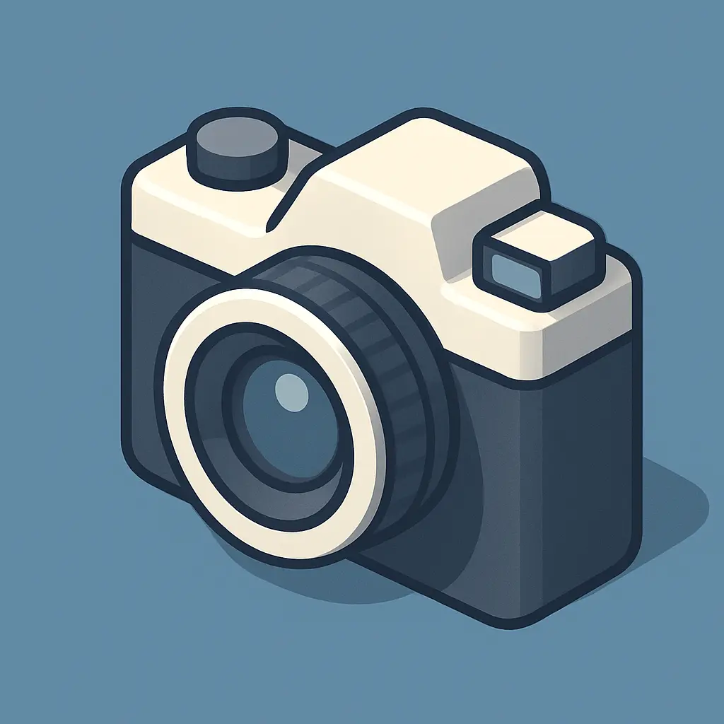
Isometric icons are perfect for technical applications and infographics where precision matters.
10. Hand-drawn Icon
Create a hand-drawn camera icon with sketchy lines and natural imperfections. Use a solid background and a 1:1 aspect ratio.
Hand-drawn icons add personality and warmth to digital interfaces.
11. Watercolor Icon
Create a watercolor-style camera icon with soft paint textures and blended edges. Background should be solid and the layout 1:1.
Watercolor icons work beautifully for creative projects and artistic brands.
12. Doodle Icon
Create a fun doodle-style icon of a camera with quirky, uneven lines. Keep it playful on a solid background with a 1:1 aspect ratio.
Doodle icons are perfect for casual apps and projects that want to feel approachable and fun.
13. Dotted Icon
Create a dotted icon of a camera using dot patterns for outlines and detailing. Use a solid background and maintain a 1:1 ratio.
Dotted icons create interesting textures and work well for brands that want something different.
14. Sticker Icon
Create a sticker-style camera icon with a bold outline, subtle shadow, and peel-effect edges. Place it on a solid background with a 1:1 aspect ratio.
Sticker icons feel physical and can add a playful element to your design.
15. Retro Icon
Create a retro-style icon of a vintage camera with muted tones, grain textures, and a nostalgic feel. Use a solid background and a 1:1 format.
Retro icons are perfect for brands that want to evoke nostalgia or vintage aesthetics.
16. Neon Icon
Create a neon-style icon of a camera with glowing blue and pink edges, like a neon sign. Use a dark solid background and keep the frame 1:1.
Neon icons work great for nightlife, gaming, or tech brands that want an edgy look.
17. Cartoon Icon
Create a 2d cartoon-style camera icon with exaggerated lens and fun details. Use bold outlines on a solid background with a 1:1 aspect ratio.
Cartoon icons are perfect for family-friendly apps and websites that want to feel welcoming.
18. Pixel Icon
Create a pixel-style icon of a camera with an 8-bit appearance and square pixel grid. Keep the background solid and the format 1:1.
Pixel icons appeal to gaming audiences and anyone who loves retro aesthetics.
19. Geometric Icon
Create a geometric icon of a camera using basic shapes like rectangles and circles. Background should be solid and the layout 1:1.
Geometric icons feel structured and work well for tech and business applications.
20. Circular Icon
Create a circular icon featuring a camera centered within a clean circle. The background should be solid, with a 1:1 aspect ratio.
Circular icons create visual consistency and work well in sets or grids.
21. Paper Cutout Icon
Create a paper cutout-style icon of a camera with layered shapes and realistic paper textures. Use a solid background and 1:1 ratio.
Paper cutout icons add a handmade feel and work well for creative or educational projects.
22. Metallic Icon
Create a metallic-style icon of a camera with shiny chrome textures and reflective highlights. Background should be solid and aspect ratio 1:1.
Metallic icons convey quality and work well for premium products or industrial applications.
Start with simple subjects when you’re learning. Complex objects might not translate well to certain icon styles.
Be specific about colors, backgrounds, and proportions. The 1:1 aspect ratio ensures your icons will work well in most applications.
Consider your brand and audience when choosing styles. A law firm might prefer clean, professional icons, while a children’s app could benefit from cartoon or doodle styles.