How to Create Icons Using Midjourney
Icons are everywhere in our digital lives. They’re those little pictures you tap on your phone or click on your computer. As someone who’s always been fascinated by design, I’ve found that creating icons can be both fun and useful.
Recently, I’ve been using Midjourney to make my own icons. In this post, I’ll share what I’ve learned about making icons with Midjourney.
We’ll look at why icons matter, how to write prompts for Midjourney, and some tips I’ve picked up along the way. By the end, you’ll have the know-how to create your own eye-catching icons.
Icons and Their Relevance
Icons are simple, visual symbols that represent ideas, actions, or objects. They’re like a universal language that helps us quickly understand information without reading text.
In my experience, icons are incredibly versatile. I use them all the time in my work:
- On websites, they guide visitors to important sections or actions.
- In apps, they make navigation intuitive and save screen space.
- In presentations, they add visual interest and help convey ideas faster.
Good icons are more than just pretty pictures. They’re functional tools that improve user experience. When designed well, icons can:
- Communicate instantly, even across language barriers
- Reduce cognitive load by simplifying complex ideas
- Make interfaces more appealing and easier to use
I’ve found that investing time in creating high-quality icons pays off. They can elevate the overall look of a project and make it more user-friendly.
As we move into the digital age, the need for clear, effective icons is growing. That’s why I’m excited to share how we can use Midjourney to create our own custom icons.
Create a Base Prompt
When I started using Midjourney for icon creation, I quickly realized that having a solid base prompt was key. After some trial and error, I came up with a template that consistently produces good results:
[Subject] icon, in [color], in a minimalistic flat design style, with a plain background in white, vector graphic, clean lines –no shadows
Let’s break this down:
- [Subject]: This is what your icon represents. It could be anything – a house, a globe, a coffee cup.
- Color: Specify the main color of your icon. This helps set the mood and ensures consistency.
- Minimalistic flat design style: This tells Midjourney to keep things simple and modern.
- Plain white background: A clean backdrop that makes your icon stand out.
- Vector graphic: This ensures crisp results.
- Clean lines: For a neat, professional look.
- –no shadows: This parameter keeps the design flat and simple by removing shadows.
I’ve found this base prompt to be versatile and effective. It gives Midjourney clear instructions while still allowing for creativity in the final output.
Example Prompts and Results
Here are some examples of icons I’ve created using my base prompt.
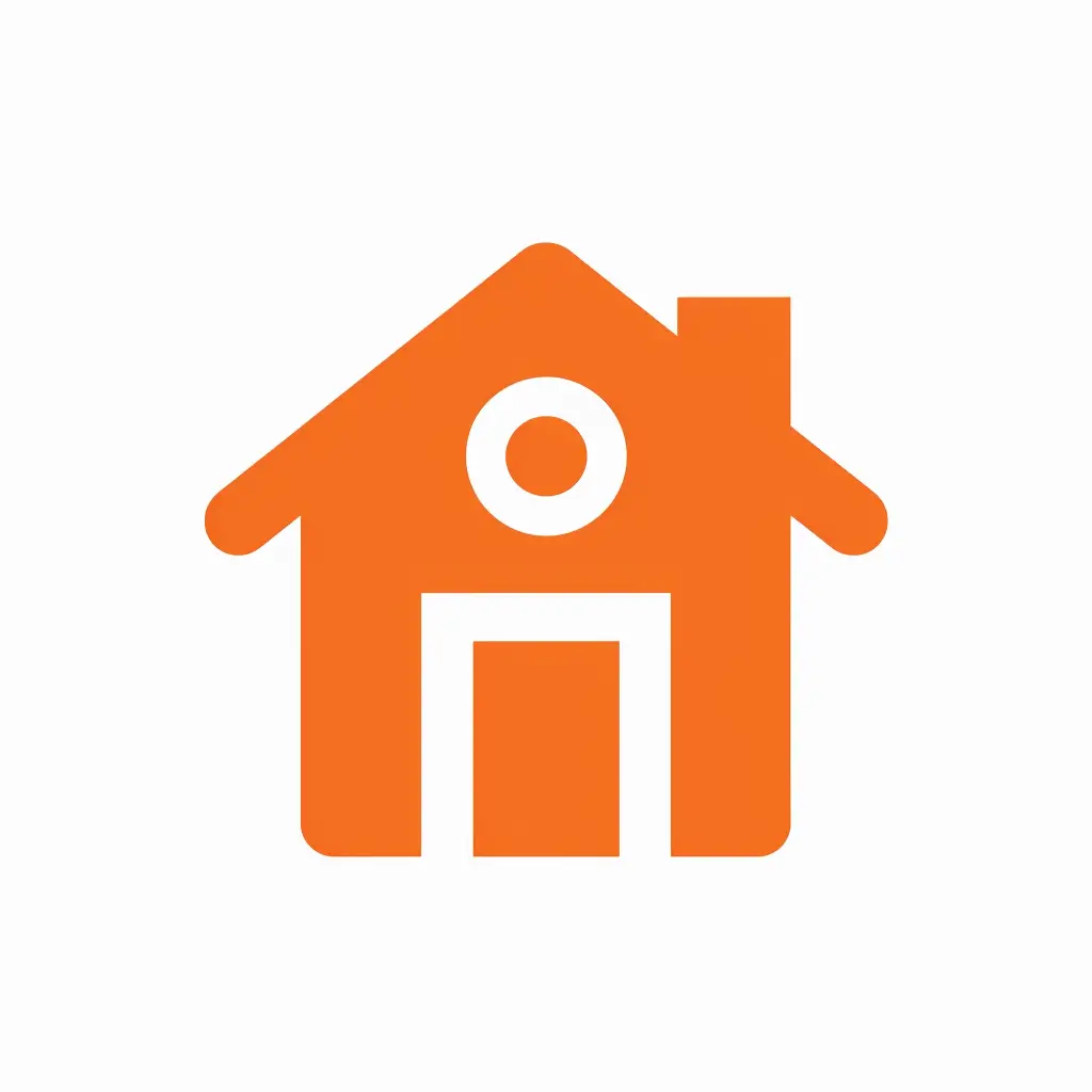
Home Icon
Prompt: Home icon, in orange, in a minimalistic flat design style, with a plain background in white, vector graphic, clean lines –no shadows
This prompt produced a simple, effective house icon. The orange color makes it warm and inviting, perfect for real estate or home-related apps.
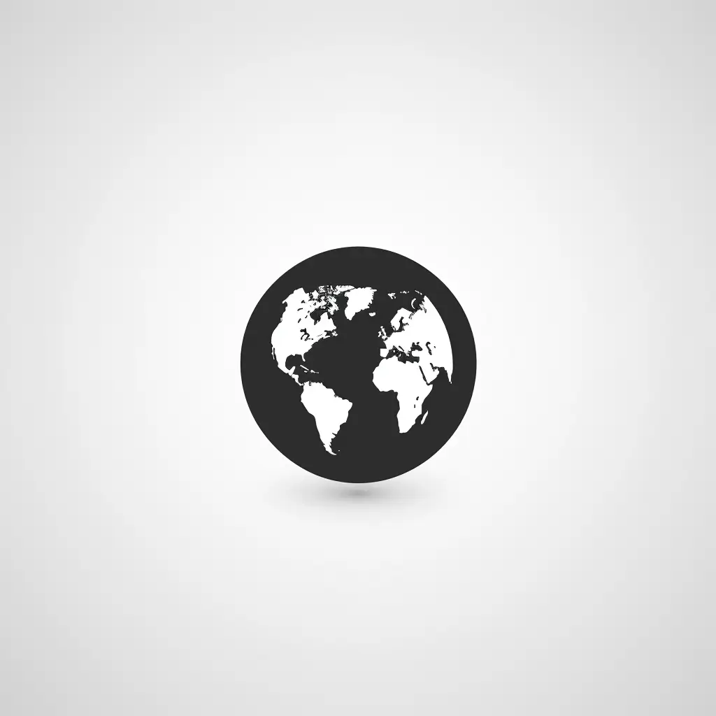
Globe Icon
Prompt: Globe icon, in black, in a minimalistic flat design style, with a plain background in white, vector graphic, clean lines –no shadows
The result was a sleek, black globe. It’s perfect for websites or apps dealing with international topics or travel.
Headphone Icon
Prompt: Headphone icon, in red, in a minimalistic flat design style, with a plain background in white, vector graphic, clean lines –no shadows
This gave me a bold, red headphone icon. It’s eye-catching and would work well for music apps or audio-related content.

Cloud Icon
Prompt: Cloud icon, in blue, in a minimalistic flat design style, with a plain background in white, vector graphic, clean lines –no shadows
The output was a simple yet recognizable cloud shape in a calming blue. Great for weather apps or cloud storage services.

Shopping Cart Icon
Prompt: Shopping cart icon, in black, in a minimalistic flat design style, with a plain background in white, vector graphic, clean lines –no shadows
This resulted in a clean, black shopping cart icon. It’s perfect for e-commerce sites or any online shopping features.

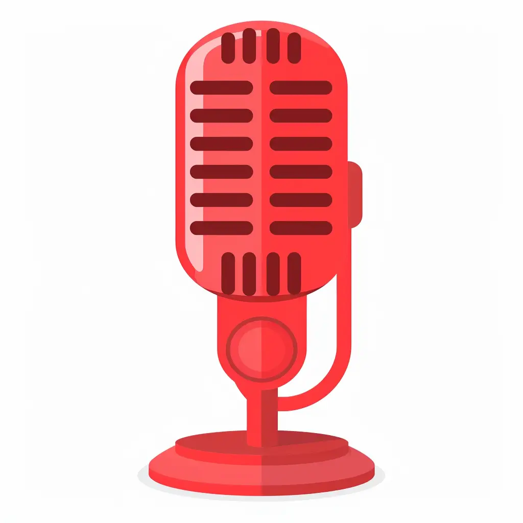
Microphone Icon
Prompt: Microphone icon, in red, in a minimalistic flat design style, with a plain background in white, vector graphic, clean lines –no shadows
The result was a striking red microphone icon. It’s ideal for voice recording apps or podcast platforms.
Envelope Icon
Prompt: Envelope icon, in black, in a minimalistic flat design style, with a plain background in white, vector graphic, clean lines –no shadows
This created a clean, black envelope icon. It’s perfect for email applications or contact sections on websites.

Coffee Cup Icon
Prompt: Coffee cup icon, in black, in a minimalistic flat design style, with a plain background in white, vector graphic, clean lines –no shadows
The output was a simple yet recognizable coffee cup icon in black. Great for cafe websites or productivity apps.
Bulb Icon
Prompt: Bulb icon, in yellow, in a minimalistic flat design style, with a plain background in white, vector graphic, clean lines –no shadows
This resulted in a bright yellow light bulb icon. It’s excellent for sections about ideas or innovation.
Sun Icon
Prompt: Sun icon, in orange, in a minimalistic flat design style, with a plain background in white, vector graphic, clean lines –no shadows
The prompt produced a vibrant orange sun icon. It’s perfect for weather apps or vacation-related websites.

Umbrella Icon
Prompt: Umbrella icon, in black, in a minimalistic flat design style, with a plain background in white, vector graphic, clean lines –no shadows
This created a sleek black umbrella icon. It’s suitable for weather forecasts or insurance websites.
Heart Icon
Prompt: Heart icon, in red, in a minimalistic flat design style, with a plain background in white, vector graphic, clean lines –no shadows
The result was a classic red heart icon. It’s versatile and can be used for likes, favorites, or health-related apps.
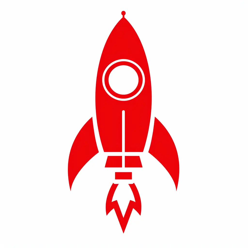
Rocket Icon
Prompt: Rocket icon, in red, in a minimalistic flat design style, with a plain background in white, vector graphic, clean lines –no shadows
This produced a dynamic red rocket icon. It’s great for startup websites or apps focused on growth and progress.
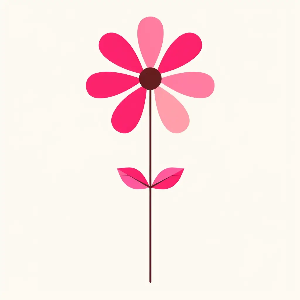
Flower Icon
Prompt: Flower icon, in pink, in a minimalistic flat design style, with a plain background in white, vector graphic, clean lines –no shadows
The result was a simple yet elegant pink flower icon. It works well for gardening apps or nature-themed designs.
Leaf Icon
Prompt: Leaf icon, in green, in a minimalistic flat design style, with a plain background in white, vector graphic, clean lines –no shadows
This created a fresh green leaf icon. It’s perfect for eco-friendly brands or health and wellness applications.

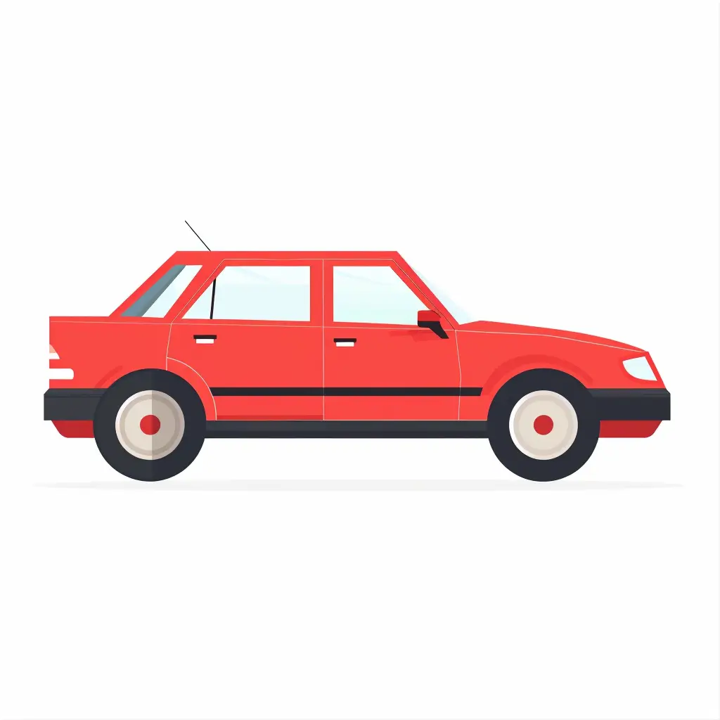
Car Icon
Prompt: Car icon, in red, in a minimalistic flat design style, with a plain background in white, vector graphic, clean lines –no shadows
The output was a sleek red car icon. It’s ideal for automotive websites or transportation apps.
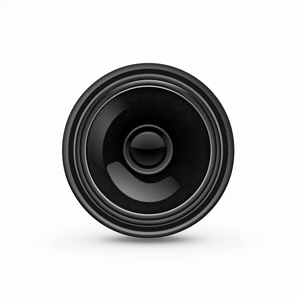
Speaker Icon
Prompt: Speaker icon, in black, in a minimalistic flat design style, with a plain background in white, vector graphic, clean lines –no shadows
This resulted in a clear, black speaker icon. It’s great for audio settings or music playback interfaces.
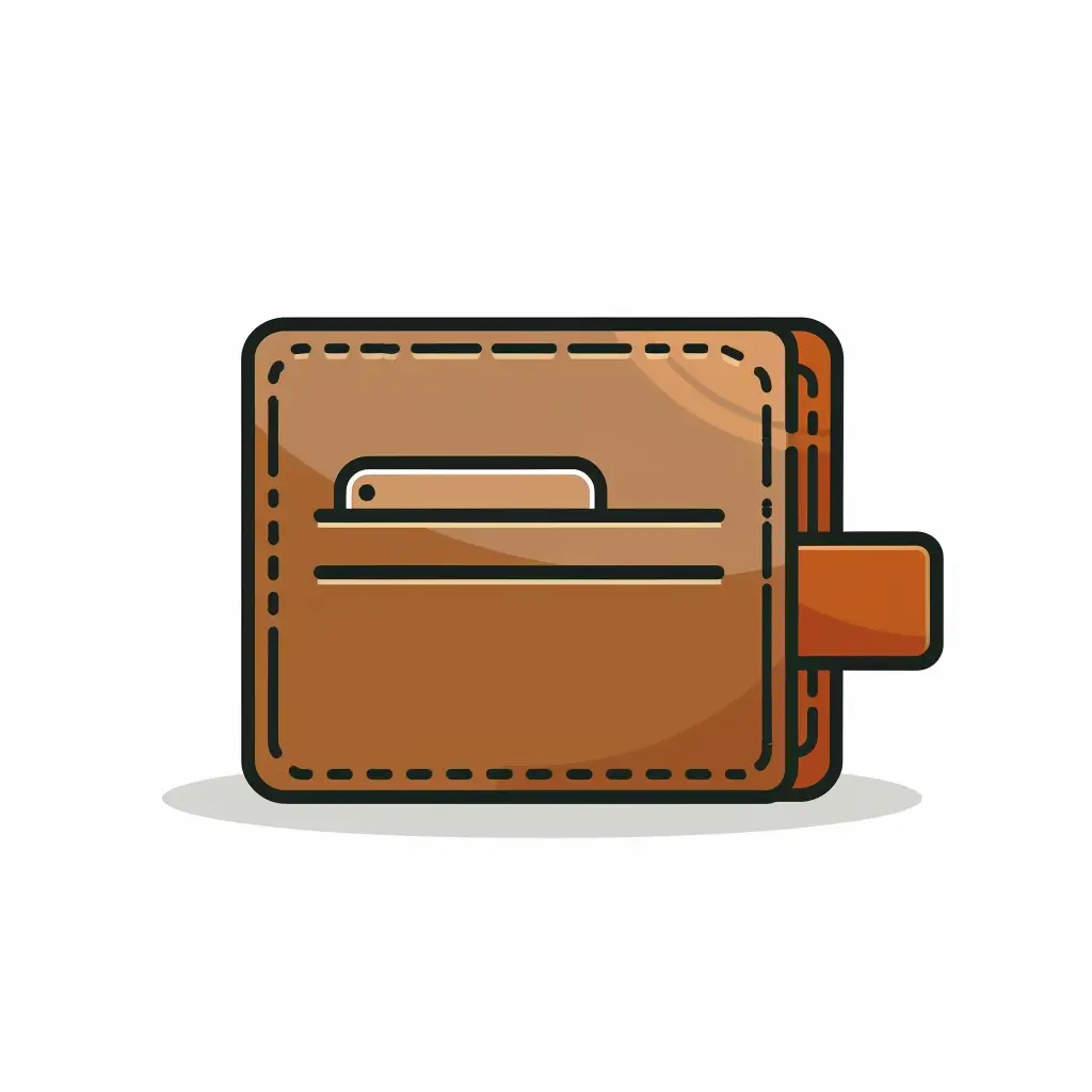
Wallet Icon
Prompt: Wallet icon, in brown, in a minimalistic flat design style, with a plain background in white, vector graphic, clean lines –no shadows
The prompt produced a simple brown wallet icon. It’s suitable for finance apps or e-commerce payment sections.
In my experience, these prompts consistently produce clean, minimalist icons that are easily recognizable. The key is sticking to the base format while changing the subject and color to suit your needs.
Tips for Creating Icons Using Midjourney
After creating numerous icons with Midjourney, I’ve picked up some useful tips. Here’s what I’ve learned:
- Keep it simple: Less is often more with icons. Stick to the essentials of what you’re trying to represent.
- Choose colors wisely: Colors can convey meaning and emotion. Pick ones that match your brand or the icon’s purpose.
- Be consistent: If you’re making a set of icons, use the same style for all of them. This creates a cohesive look.
- Experiment with variations: Try different angles or styles for the same subject. You might stumble upon something great.
- Consider context: Think about where and how your icon will be used. This can guide your design choices.
- Iterate: Your first attempt might not be perfect. That’s okay. Keep tweaking until you’re happy with the result.
- Learn from others: Look at icon designs you admire. What makes them effective? How can you apply those principles to your work?
- Be patient: Creating great icons takes practice. Don’t get discouraged if your first attempts aren’t perfect.
With these tips and some practice, you’ll be creating eye-catching icons in no time.
Creating icons with Midjourney has been a game-changer for me. It’s opened up a world of design possibilities that I didn’t have access to before.
The process is straightforward: start with a clear prompt, experiment with different subjects and colors, and refine your results. With practice, you’ll develop an eye for what works and what doesn’t.
Good icons are more than just pretty pictures. They’re functional tools that help users navigate digital spaces more easily. By creating your own icons, you’re not just making art – you’re improving user experiences.
I hope this guide helps you on your icon creation journey. Whether you’re a designer, a developer, or just someone who likes to tinker with visuals, Midjourney offers an accessible way to bring your ideas to life.
So go ahead, give it a shot.
