15 Gemini Nano Banana Pro Prompts for Infographics
Infographics are visual representations of information designed to make complex data easy to understand at a glance. Instead of reading paragraphs of text, people can quickly grasp key points through images, charts, icons, and minimal text.
I’ve found that infographics work incredibly well for blogs, social media, presentations, and educational materials. They break up dense information into digestible chunks, which is exactly what today’s readers want.
The beauty of infographics is their flexibility. You can use them to explain processes, compare products, show statistics, or share timelines. Whether you’re teaching something new or presenting data, a well-designed infographic does the heavy lifting for you.
Why Google’s Gemini Nano Banana Pro for Infographics
Google released their latest image model, and it’s genuinely impressive. The Gemini Nano Banana Pro handles realistic photos beautifully, but here’s what really caught my attention: it’s excellent with text, graphics, and editing.
What makes this different is how accurately it renders text within graphics. Previous models struggled with readable text in images, but this one gets it right. You can ask for bold typography, clear labels, and specific text placements, and it delivers.
For creating infographics specifically, this model understands layout, spacing, and visual hierarchy in ways that feel natural. When you describe how you want information organized, it actually listens to those instructions.
How to Get Started
Here’s the simple process I follow:
Go to gemini.google.com and create a new conversation. Look for the option that says “Thinking with 3 pro” and select it. Then type your prompt directly into the chat.
If you want to reference something specific, you can upload a photo as a guide. This helps the model understand your style preferences or specific requirements.
Copy any of the prompts below and paste them exactly as written. If you want customize them according to your needs, and let the model do the rest.
The 15 Prompts for Infographics
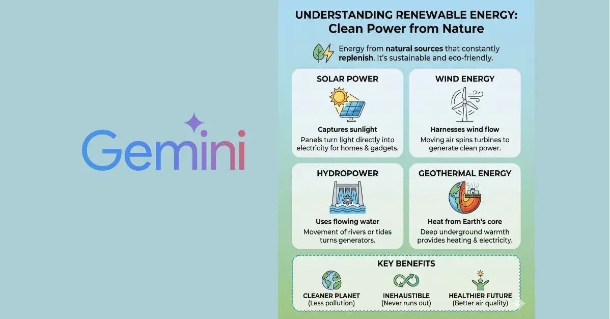
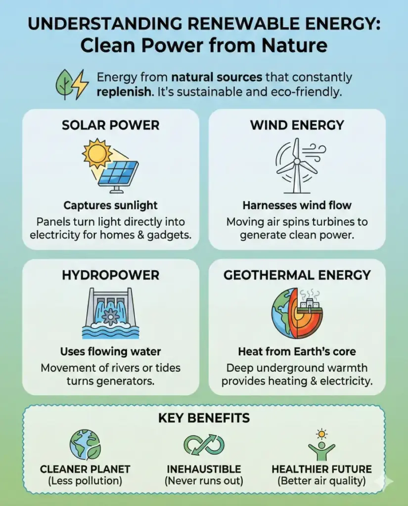
Informational infographic
Create an informational infographic explaining the topic of renewable energy in simple language, using clean icons, short text blocks, clear headings, and a calm color palette of green and blue. The layout should be well spaced, easy to scan, and suitable for blog readers. Use aspect ratio 4:5.
Statistical infographic
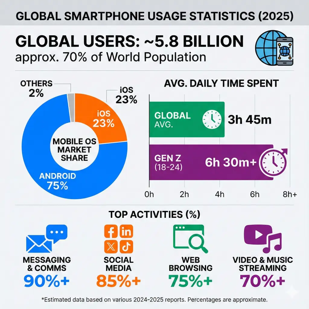
Create a statistical infographic showing global smartphone usage statistics, including percentages, bar charts, pie charts, and bold numbers. Use modern flat design, contrasting colors, and minimal text to highlight key data points clearly. Use aspect ratio 1:1.
Timeline infographic
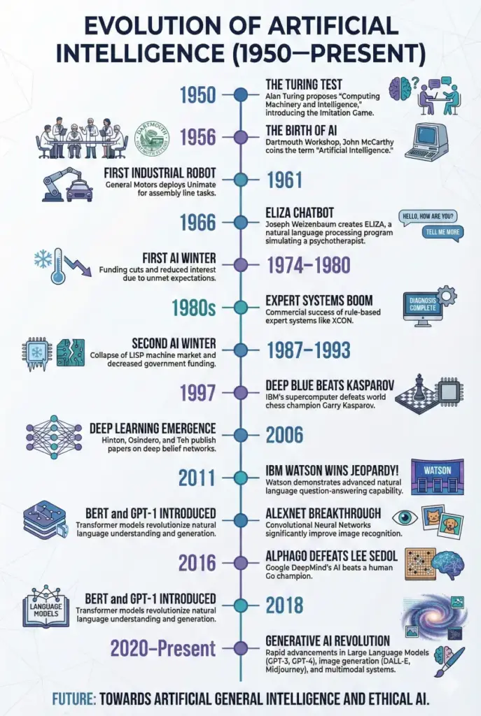
Create a timeline infographic showing the evolution of artificial intelligence from 1950 to present, arranged vertically with dates, milestones, small illustrations, and connecting lines. Use a professional color scheme and clean typography. Use aspect ratio 2:3.
Process infographic
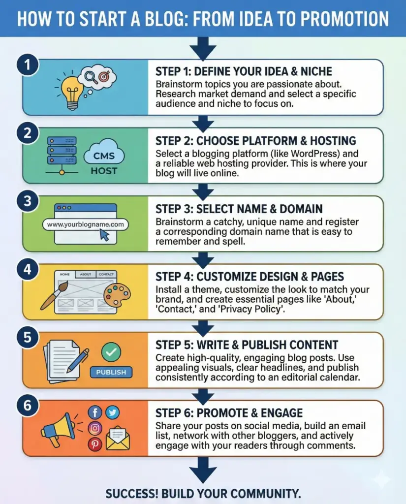
Create a process infographic explaining the steps of starting a blog, from idea selection to publishing and promotion. Use numbered steps, arrows, icons, and short descriptions in a logical top-to-bottom flow. Use aspect ratio 4:5.
Comparison infographic
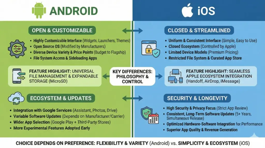
Create a comparison infographic comparing Android vs iOS, split into two vertical sections with icons, bullet points, feature highlights, and contrasting color themes for each side. Keep the design balanced and easy to understand. Use aspect ratio 16:9.
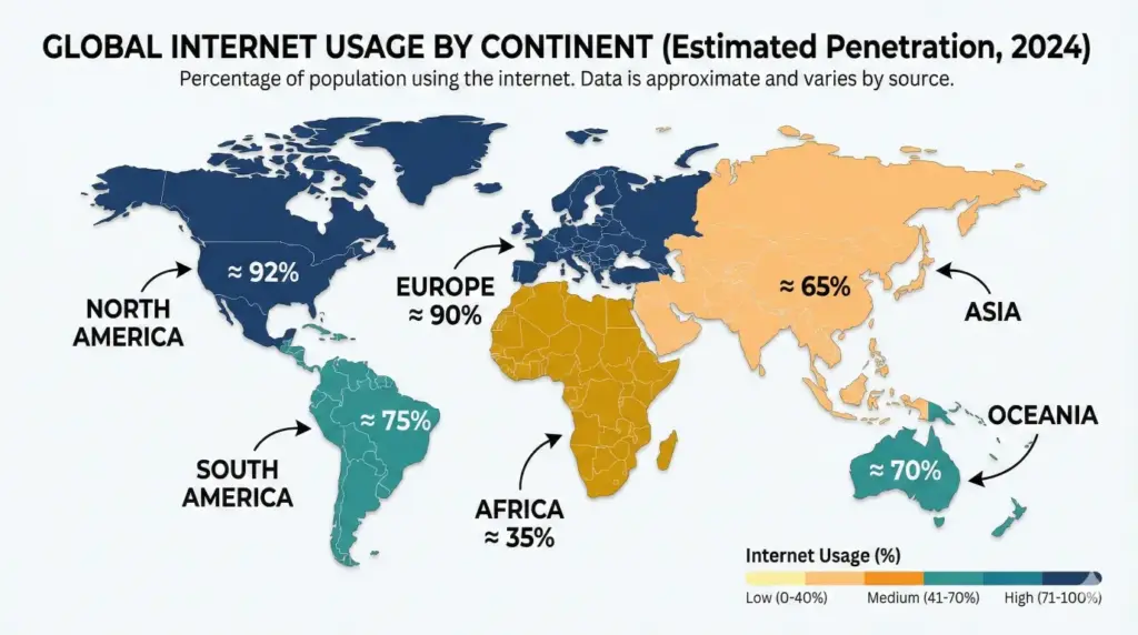
Geographic infographic
Create a geographic infographic showing internet usage by continent, using a world map, color-coded regions, labels, and percentage markers. Use a clean background and readable fonts suitable for educational content. Use aspect ratio 16:9.
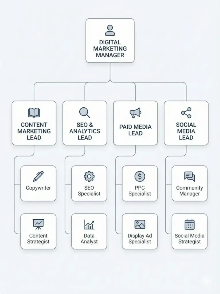
Hierarchical infographic
Create a hierarchical infographic showing the structure of a digital marketing team, starting from manager at the top and team roles below, connected with lines and icons. Use a minimal corporate design style. Use aspect ratio 3:4.
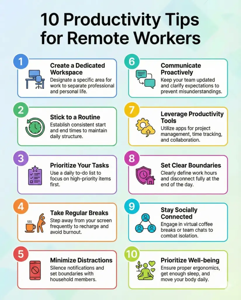
List-based infographic
Create a list-based infographic titled “10 Productivity Tips for Remote Workers,” using numbered sections, small icons, short text blocks, and consistent spacing. The style should be modern and easy to read. Use aspect ratio 4:5.
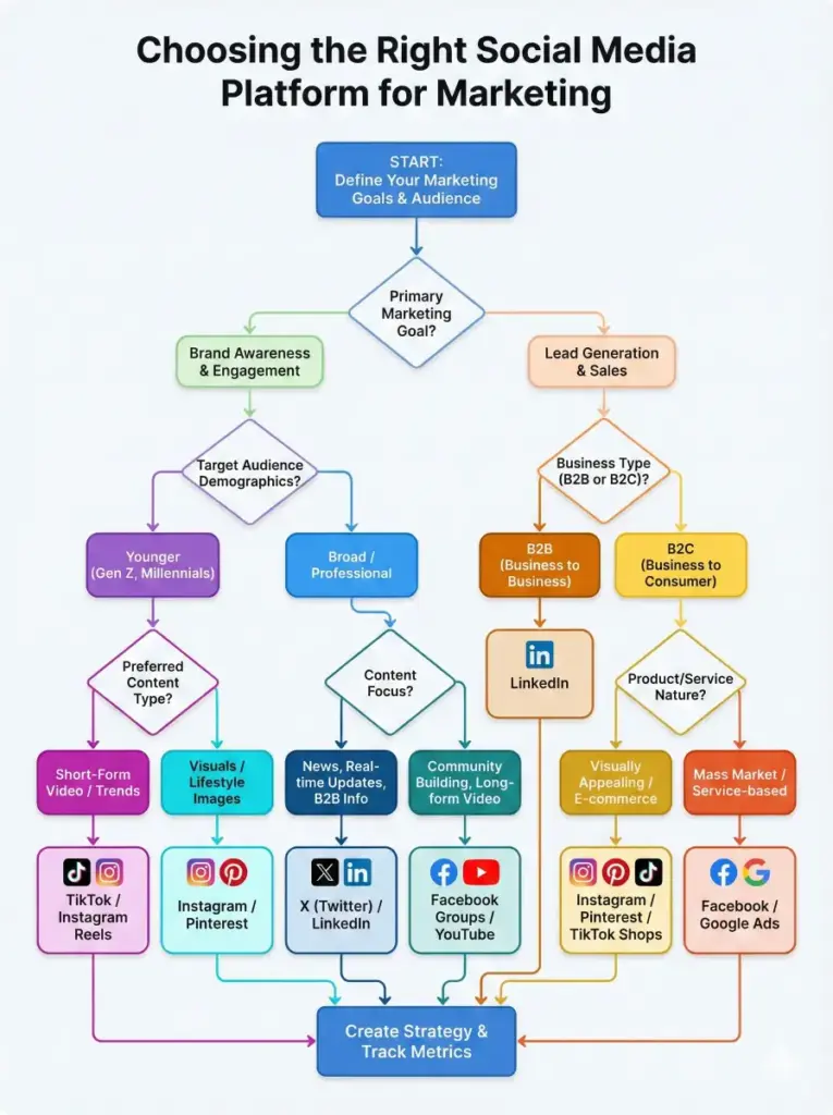
Flowchart infographic
Create a flowchart infographic that helps users decide which social media platform to use for marketing, with decision boxes, arrows, yes or no paths, and clear labels. Use a simple color scheme and logical layout. Use aspect ratio 3:4.
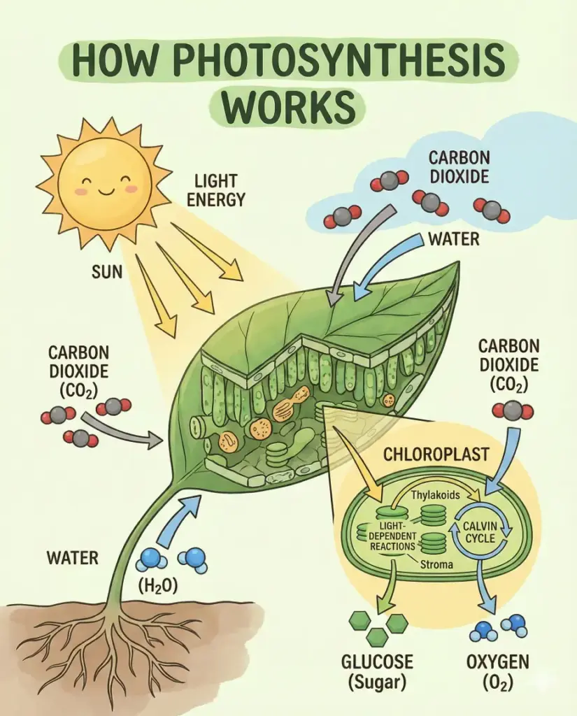
Educational infographic
Create an educational infographic explaining how photosynthesis works, using diagrams, arrows, labels, and simple illustrations. The design should feel suitable for students and learning materials. Use aspect ratio 4:5.
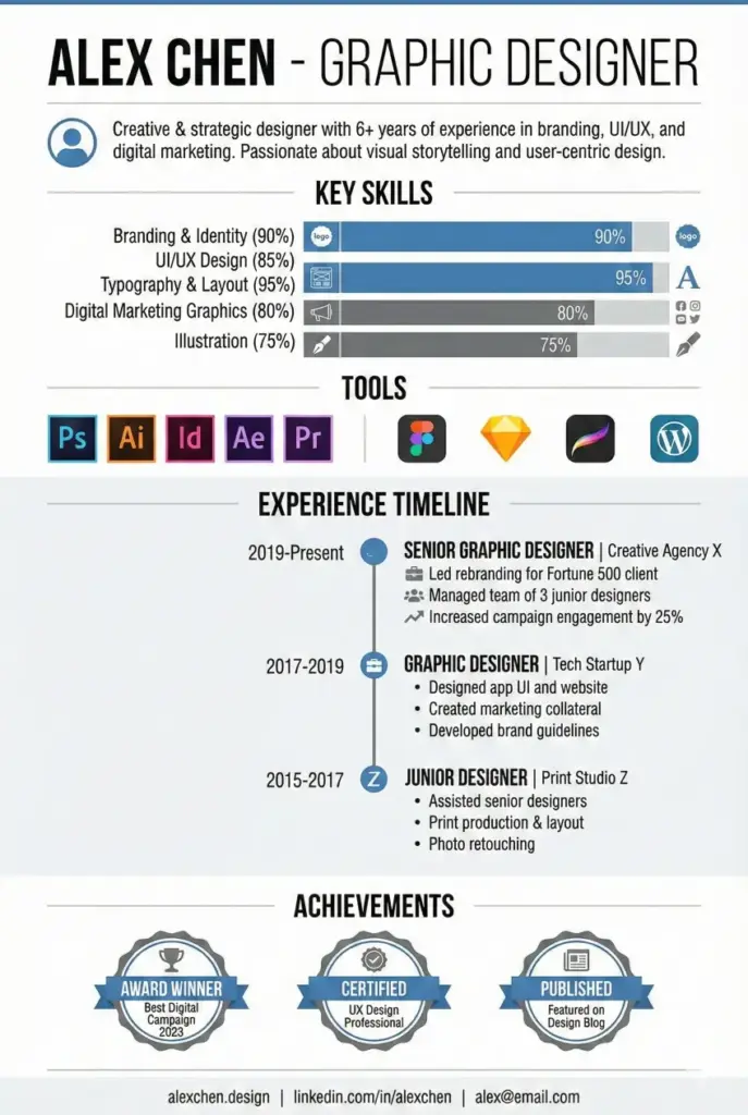
Resume infographic
Create a resume-style infographic for a graphic designer, showcasing skills, experience timeline, tools, and achievements using icons, charts, and a clean modern layout. Use aspect ratio 2:3.
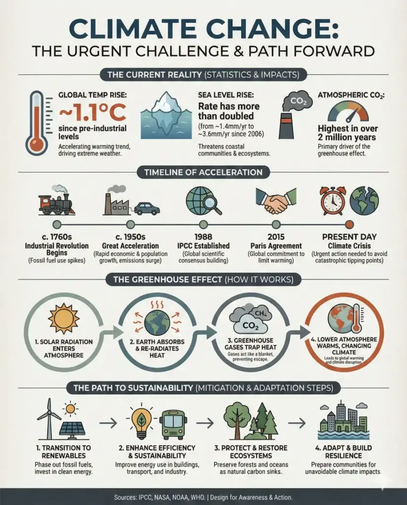
Mixed-style infographic
Create a mixed-style infographic about climate change that combines statistics, icons, a small timeline, and process steps in one cohesive design. Use a professional editorial look with consistent colors and typography. Use aspect ratio 4:5.
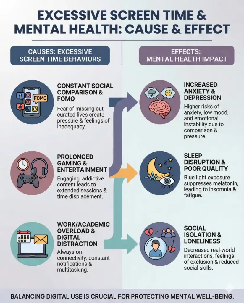
Cause and effect infographic
Create a cause and effect infographic explaining how excessive screen time impacts mental health, showing clear cause sections on one side and corresponding effects on the other using icons, arrows, and short explanatory text. Use a calm but serious color palette with good contrast for readability. Use aspect ratio 4:5.
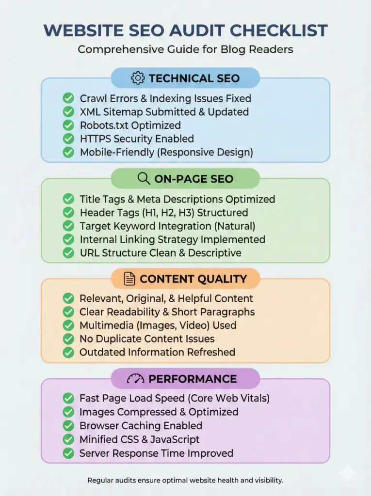
Checklist infographic
Create a checklist-style infographic for a website SEO audit, including sections like technical SEO, on-page SEO, content quality, and performance, with check icons, short bullet points, and a clean professional layout suitable for blog readers. Use aspect ratio 3:4.
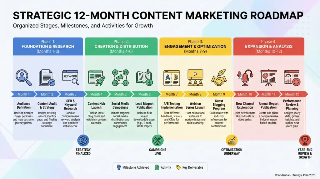
Roadmap infographic
Create a roadmap infographic showing a 12-month content marketing plan, divided into phases with milestones, icons, timelines, and brief descriptions. The design should look strategic and organized with a modern editorial style. Use aspect ratio 16:9.
I’ve tested this approach multiple times, and the results consistently impress me. The Gemini Nano Banana Pro gives you infographics that actually look professional, not like something generated by an AI that doesn’t understand design.
The key is being specific with your prompts. Tell it exactly what you want: the colors, the layout, the text placement, the aspect ratio. The more detail you provide, the better the output.
If you’re creating content for your blog or business, these prompts will save you serious time and money. No need to hire a designer or spend hours in design software. Give these a try and see what you can create.