How to Create Viral YouTube Thumbnails Using Google Gemini
YouTube thumbnails can make or break your video’s success. A good thumbnail grabs attention in a split second and gets people to click. I’ve been using Google Gemini to create my thumbnails, and the results have been fantastic.
Think about it. You’re scrolling through YouTube, and hundreds of videos are competing for your attention. What makes you stop? It’s usually a thumbnail that stands out. The colors pop. The text is clear. The image tells you exactly what you’re about to watch.
That’s the power of a well-designed thumbnail. Now you don’t need expensive software or design skills to create one anymore.
Why Gemini Works So Well for Thumbnails
Gemini makes thumbnail creation simple. You don’t need Photoshop skills or hours of editing time. The AI handles the heavy lifting while you focus on what matters: making your content stand out.
I specifically use the Nano Banana Pro model. This model excels at generating text overlays, which is huge for thumbnails. Clean, readable text can be tricky to add in traditional design software. You need to pick the right font, size, outline, and shadow. Get one element wrong, and your text becomes unreadable on mobile devices.
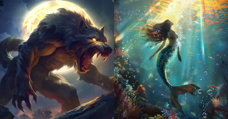
The model also creates realistic photos and handles photo editing better than the standard Nano Banana model. If you’ve used other AI image generators, you know they sometimes create weird, unnatural-looking images. Fingers might be wrong. Faces might look distorted. Colors might be off.
Nano Banana Pro avoids most of these issues. The images it generates look natural and professional. People won’t be able to tell at first glance that AI created your thumbnail.
How to Get Started
Head over to gemini.google.com or open your Gemini app. The web version works great on desktop, but I actually prefer the mobile app for quick thumbnail creation. You can snap a photo of yourself, upload it immediately, and generate a thumbnail in minutes.
Start a new conversation. This ensures Gemini focuses only on your thumbnail project without getting confused by previous requests.
Select ‘Pro’ from the model picker. This is important. The Pro model gives you access to Nano Banana Pro, which has all the features I mentioned earlier. The standard model won’t produce the same quality results.
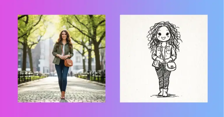
Upload a photo of yourself (or whoever will appear in your thumbnail). This photo becomes your base. Gemini will keep your facial features consistent while changing your expression to match your video’s mood.
Then type in your prompt.
The Template Prompt That Works
Here’s the exact template I use for every thumbnail:
Create a high-impact YouTube thumbnail using the person from Image 1 as the main subject in 16:9 aspect ratio. Maintain full face consistency by keeping the person’s facial features exactly the same as in Image 1, while changing the expression to match the video’s emotion, such as excited, shocked, curious, or confident. Position the person on either the left or right side of the frame and pose them pointing, looking, or reacting toward the main subject area. Place a clear, high-quality visual of [MAIN TOPIC / OBJECT / RESULT / SCENE] on the opposite side of the frame as the primary focus. Add a bold visual element, such as an arrow, circle, or highlight, to guide attention from the person to the main subject. Overlay large, attention-grabbing YouTube-style text in the center or upper third reading “[SHORT HOOK TEXT]”, using thick lettering with a strong outline and drop shadow for maximum readability on mobile devices. Set the background to [RELEVANT CONTEXT OR SCENE] with a soft blur to keep the foreground dominant. Use vibrant colors, high saturation, and strong contrast to create a clean, click-worthy thumbnail that clearly communicates the video idea at a glance.
I know this looks long, but each part serves a specific purpose. I’ll break it down for you later. For now, just know that this template consistently produces high-quality thumbnails that get clicks.
The two bracketed sections are where you customize the prompt for your specific video. Replace [MAIN TOPIC / OBJECT / RESULT / SCENE] with whatever your video is about. Replace [SHORT HOOK TEXT] with the text you want on your thumbnail.
Keep the hook text short. Three to five words maximum. Something like “30-Day Results” or “Hidden Feature” or “3 Minutes Only.” The shorter, the better.
Real Examples That Get Clicks
Let me show you three examples from different niches. These follow the exact template I just shared, but customized for specific types of content.
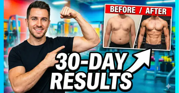
Fitness Transformation Thumbnail
Create a high-impact YouTube thumbnail using the person from Image 1 as the main subject in 16:9 aspect ratio. Maintain full face consistency by keeping the person’s facial features exactly the same as in Image 1, while changing the expression to look confident and motivated. Position the person on the left side of the frame and pose them pointing toward the right side. Place a clear, high-quality visual of a before-and-after fitness transformation on the right side of the frame as the primary focus. Add a bold white arrow to guide attention from the person to the transformation images. Overlay large, attention-grabbing YouTube-style text in the center reading “30-Day Results,” using thick lettering with a strong outline and drop shadow. Set the background to a blurred gym environment. Use vibrant colors, high saturation, and strong contrast to create a clean, click-worthy thumbnail that clearly communicates the video idea at a glance.
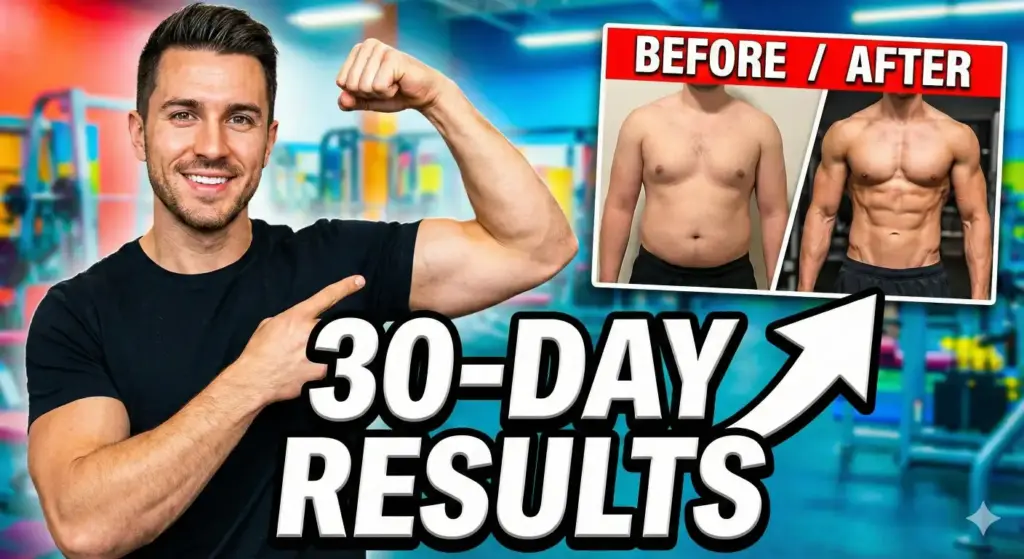
This works perfectly for fitness content. The before-and-after visual immediately tells viewers what they’ll get from watching. The confident expression reinforces that this is a success story. The gym background adds context without distracting from the main elements.
Tech Tutorial Thumbnail
Create a high-impact YouTube thumbnail using the person from Image 1 as the main subject in 16:9 aspect ratio. Maintain full face consistency by keeping the person’s facial features exactly the same as in Image 1, while changing the expression to look shocked and curious. Position the person on the right side of the frame and pose them pointing toward the left side. Place a clear, high-quality visual of a smartphone screen showing a new app interface on the left side of the frame as the primary focus. Add a bold red arrow to guide attention from the person to the app screen. Overlay large, attention-grabbing YouTube-style text in the upper center reading “Hidden Feature,” using thick lettering with a strong outline and drop shadow. Set the background to a blurred modern workspace or desk setup. Use vibrant colors, high saturation, and strong contrast to create a clean, click-worthy thumbnail that clearly communicates the video idea at a glance.
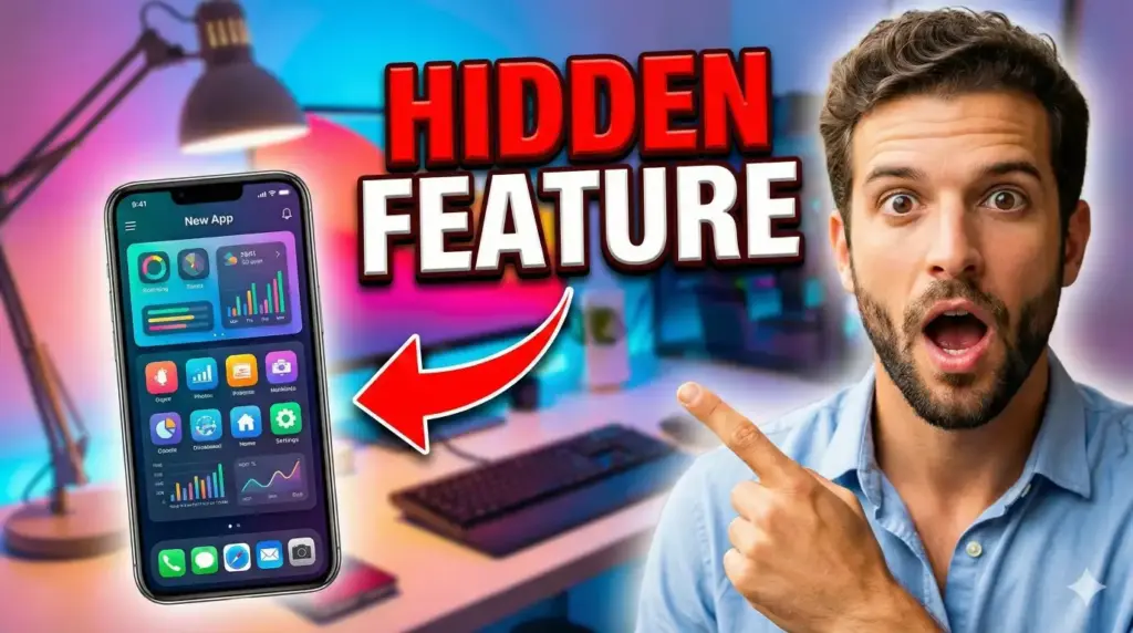
Tech content needs a different approach. The shocked expression creates intrigue. It signals that you’re about to reveal something surprising or little-known.
Notice how this example positions the person on the right instead of the left. Changing the layout keeps your thumbnails from looking repetitive if you post frequently.
Quick Recipe Thumbnail
Create a high-impact YouTube thumbnail using the person from Image 1 as the main subject in 16:9 aspect ratio. Maintain full face consistency by keeping the person’s facial features exactly the same as in Image 1, while changing the expression to look excited and surprised. Position the person on the left side of the frame and pose them pointing toward the right side. Place a clear, high-quality visual of a freshly made avocado toast on the right side of the frame as the primary focus. Add a bold yellow arrow to guide attention from the person’s finger to the toast. Overlay large, attention-grabbing YouTube-style text in the center reading “3 Minutes Only,” using thick lettering with a strong white outline and a subtle drop shadow. Set the background to a bright modern kitchen with a soft blur. Use vibrant colors, high saturation, and strong contrast to create a clean, click-worthy thumbnail that clearly communicates the video idea at a glance.
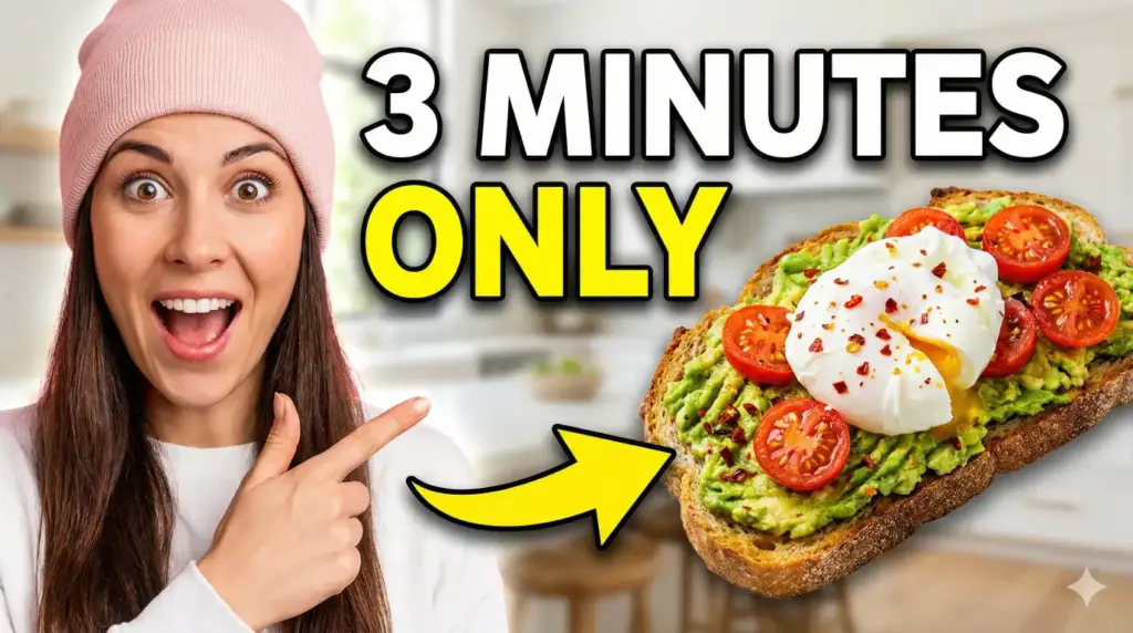
Food content lives or dies by how appetizing the food looks. The avocado toast needs to look fresh, vibrant, and delicious. If it doesn’t make people hungry, they won’t click.
The excited expression matches the energy of quick, easy recipes. You’re not just showing food. You’re showing enthusiasm about how simple it is to make.
Break Down of the Template
Now let me explain each part of the template so you can customize it for your videos. Understanding why each element matters will help you create better prompts.
Face Consistency
“Maintain full face consistency by keeping the person’s facial features exactly the same as in Image 1, while changing the expression to match the video’s emotion.”
This part is critical. You want viewers to recognize you across all your thumbnails. Building that recognition helps with branding. People start to associate your face with your content.
But you also need to show emotion. A neutral expression doesn’t grab attention. Emotions like excitement, shock, curiosity, or confidence make people want to know more.
Positioning
“Position the person on either the left or right side of the frame and pose them pointing, looking, or reacting toward the main subject area.”
Positioning yourself to one side creates balance. It gives your main visual element room to breathe. If you’re centered, there’s no space for the actual content of your video.
Pointing or looking toward the other side guides viewer attention. People naturally follow where someone is looking or pointing. It’s a psychological trigger you can use to direct eyes toward your main message.
The pose also creates movement and energy. A static, straight-on photo feels boring. Someone actively pointing or reacting feels dynamic and engaging.
Alternate between left and right positioning across your videos. This variety keeps your channel page interesting when people look at multiple thumbnails.
Main Visual Element
“Place a clear, high-quality visual of [MAIN TOPIC / OBJECT / RESULT / SCENE] on the opposite side of the frame as the primary focus.”
This is what your video is actually about. Not you. Not the text. The thing you’re teaching, showing, or demonstrating.
Make it crystal clear. Someone should be able to understand your video topic just by looking at this element. If you’re showing a product, make sure the product is recognizable. If you’re showing a result, make the before-and-after obvious. If you’re showing a scene, make it visually interesting.
“High-quality” matters here. Blurry or pixelated visuals make your whole thumbnail look unprofessional. If you can’t find a good image of what you need, you might need to create it separately or choose a different visual angle for your thumbnail.
The “opposite side” instruction creates that balanced composition I mentioned. You’re on one side. Your content is on the other. Everything has its place.
Visual Guide
“Add a bold visual element, such as an arrow, circle, or highlight, to guide attention from the person to the main subject.”
Arrows are the most common choice, but circles and highlights work too. The goal is to create a visual path that’s impossible to miss.
These elements feel almost childish when you’re designing them, but they work incredibly well. People’s eyes follow them automatically. Even if someone is only half-paying attention while scrolling, these guides pull focus where you want it.
Color matters here. Red for urgency or importance. Yellow for friendly, accessible content. White for clean, professional looks. Blue for trust and reliability. Match the color to your content’s mood.
Make it bold. Subtle guides don’t work. The arrow or circle needs to be thick and obvious. You want it to be the second thing people notice after your face.
Text Overlay
“Overlay large, attention-grabbing YouTube-style text in the center or upper third reading [SHORT HOOK TEXT]”, using thick lettering with a strong outline and drop shadow for maximum readability on mobile devices.”
The text is your hook. It’s the promise you’re making to viewers. It’s why they should click your video instead of the dozens of others competing for attention.
Keep it short. Really short. Three words is ideal. Five words maximum. Anything longer gets cluttered and hard to read, especially on phones.
The text needs to be large enough to read on a smartphone screen. Most YouTube views happen on mobile devices now. If someone can’t read your text on their phone, your thumbnail has failed.
“Thick lettering with a strong outline and drop shadow” ensures readability against any background. Without the outline, your text might blend into the background colors. Without the shadow, it might lack depth and punch.
The outline should be a contrasting color. If your text is white, use a black or dark outline. If your text is black, use a white or bright outline. This creates maximum contrast.
Center or upper third placement works best. Center text dominates the thumbnail. Upper third text leaves room for YouTube’s timestamp overlay (which appears in the bottom right corner). Choose based on your layout.
Background Context
“Set the background to [RELEVANT CONTEXT OR SCENE] with a soft blur to keep the foreground dominant.”
The background tells viewers what category your content fits into. A gym for fitness. A kitchen for cooking. A workspace for tech. A car interior for automotive content.
But it can’t compete with your main elements. That’s why the soft blur is essential. It provides context without distraction. Viewers can tell what environment you’re in without getting lost in background details.
The blur also makes your foreground elements (you, the main visual, the text) pop more. They become sharper and more defined by contrast.
Choose backgrounds that match your content but aren’t overly busy. A bookshelf works for educational content, but not if it’s so packed with items that it becomes visually chaotic even when blurred.
Visual Impact
“Use vibrant colors, high saturation, and strong contrast to create a clean, click-worthy thumbnail that clearly communicates the video idea at a glance.”
This instruction ensures your thumbnail stands out in a crowded feed. Muted, desaturated colors get lost. Vibrant colors catch the eye immediately.
High saturation makes colors look rich and energetic. It gives your thumbnail a professional, polished feel. It signals that the video itself will be high-quality.
Strong contrast between elements prevents everything from blurring together. Dark text on light backgrounds. Light text on dark backgrounds. Bright subjects against softer backgrounds. Each element needs separation.
“At a glance” is the key phrase. Someone should understand your video in under a second. If they need to study your thumbnail to figure out what it’s about, you’ve lost them.
Tips for Better Results
Now that you understand the template, let me share some tips I’ve learned from creating hundreds of thumbnails with Gemini.
Be Specific About Colors
Don’t just say “vibrant colors.” Specify the exact colors you want. “Use bright orange and electric blue” or “Use warm yellows and reds” or “Use cool blues and purples.” The more specific you are, the better your results.
Color psychology matters. Red creates urgency and excitement. Blue builds trust and calm. Yellow feels friendly and accessible. Green suggests growth and health. Choose colors that match your video’s message.
Test Multiple Versions
Generate three or four versions of the same thumbnail with slight variations. Change the expression. Adjust the text. Try different arrow colors. Then pick the best one.
Gemini generates results quickly, so creating multiple versions only takes a few minutes. This gives you options and helps you understand what works best for your audience.
Consider Your Channel Aesthetic
Look at your existing thumbnails. Do they have a consistent style? If yes, incorporate those elements into your prompts. If no, now’s the time to develop one.
Consistency helps with brand recognition. People should be able to identify your videos just by the thumbnail style. This doesn’t mean every thumbnail looks identical, but they should share common elements like color schemes, layout patterns, or text styles.
Pay Attention to Text Placement
YouTube adds several overlays to thumbnails: the video duration in the bottom right, the “New” badge for recently uploaded videos, and sometimes channel badges. Make sure your text doesn’t get covered by these elements.
That’s why upper third or center placement works best. Bottom placement risks getting covered by the duration stamp.
Use Emotional Expressions
Generic smiling doesn’t cut it anymore. Be specific about the emotion you want. “Shocked with mouth open and wide eyes” performs better than “surprised.” “Confident with a slight smirk” performs better than “happy.”
Exaggerated expressions work well on thumbnails. What feels too dramatic in person looks perfect when compressed to thumbnail size. Don’t be afraid to go big with emotions.
Make the Main Visual Crystal Clear
Your main visual element should be instantly recognizable even at thumbnail size. Test this by looking at your thumbnail in a small preview. Can you still tell what it is? If not, make it larger or clearer in your prompt.
Close-ups work better than wide shots. A close-up of a smartphone screen is better than a full desk setup. A close-up of the finished dish is better than a wide kitchen shot.
Include Lighting Instructions
If your thumbnail looks flat or dull, add lighting instructions to your prompt. “Use bright, even lighting” or “Add dramatic side lighting” or “Include a soft glow around the main subject.” Lighting creates depth and makes your thumbnails more visually appealing.
Refine Your Hook Text
Your hook text makes or breaks the thumbnail. Test different options. Which creates more curiosity? Which promises clearer value? Which is shorter and punchier?
Some formulas that work well:
- Time-based: “3 Minutes Only,” “30-Day Results”
- Mystery-based: “Hidden Feature,” “Secret Method”
- Benefit-based: “Save $1000,” “Lose 10 Pounds”
- Shock-based: “I Was Wrong,” “This Changed Everything”
- How-to-based: “Easy Fix,” “Simple Trick”
Don’t Forget Mobile
Always check how your thumbnail looks on a phone. Text that’s readable on desktop might be too small on mobile. Elements that are distinct on a large screen might blur together on a small one.
Take a screenshot of your thumbnail and view it at actual phone size. If anything feels unclear or hard to read, adjust your prompt.
Creating viral YouTube thumbnails used to require design skills, expensive software, and hours of work. Now, with Google Gemini and the Nano Banana Pro model, anyone can create professional-looking thumbnails in minutes.
The key is understanding what makes thumbnails work: clear visuals, strong emotions, bold text, and smart composition. The template I’ve shared handles all of this automatically. You just need to customize it for your specific content.
Start with the template. Generate a few thumbnails. Test them on your videos. Refine your approach based on what works. Pretty soon, you’ll develop an intuition for what your audience responds to.
Your thumbnail is your video’s first impression. Make it count. With the right tools and the right approach, you can create thumbnails that stop scrollers in their tracks and turn them into viewers.
Now go create some thumbnails and watch your click-through rates improve.