ChatGPT Prompts for Back to School Posters

Get our stories first in Google Search
Back to school season means classroom walls, hallway boards, and shop windows all need something fresh. Making those posters by hand takes hours, and stock templates always look like everyone else’s.
ChatGPT handles poster design surprisingly well now. It gets typography, layout, and color balance right most of the time, and it can place readable text directly on the design.
To use these, open chatgpt.com or the ChatGPT app, start a new chat, and paste the prompt in. Ask for an image and it will generate the poster for you.
Here are 15 poster prompts you can copy and use right away.
1. Chalkboard Welcome Poster
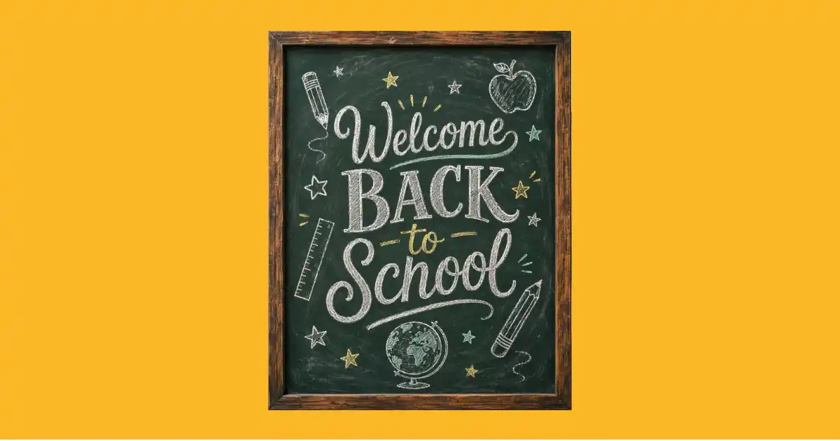
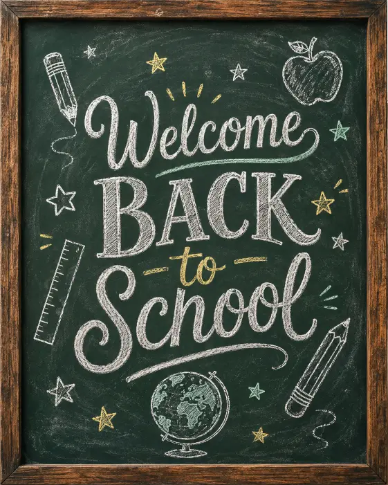
This one works great for classroom doors and entrance walls. The chalk texture gives it a handmade feel without any of the actual work.
Create a back to school poster designed to look like a dark green chalkboard with a worn wooden frame. In the center, hand lettered chalk text reads “Welcome Back to School” in a mix of bold serif and looping script styles. Around the text, draw simple white chalk doodles of pencils, an apple, a ruler, a globe, and small stars scattered across the board. Add faint chalk dust smudges and eraser streaks for realism. Light the scene evenly with soft classroom light so the chalk lines stay crisp. Keep the color palette to white chalk, pale yellow, and soft mint green against the dark green board. The style should feel warm, handmade, and slightly nostalgic. Use aspect ratio 4:5.
2. Retro School Supplies Flat Lay
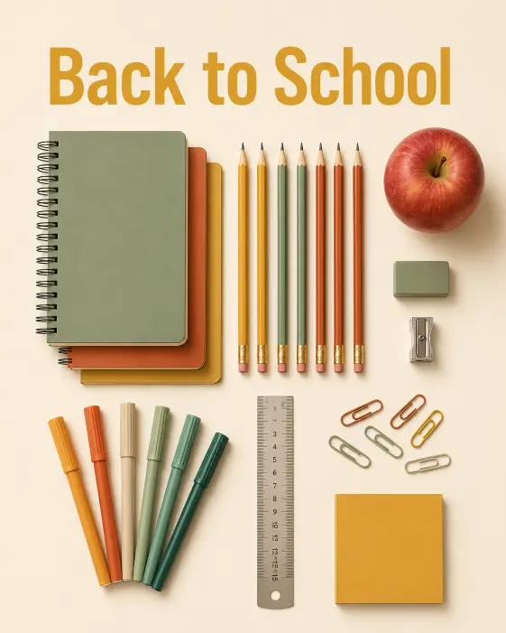
A flat lay poster is clean, colorful, and works on almost any wall. This one keeps the supplies as the whole design.
Create a top down flat lay poster of school supplies arranged neatly on a warm cream background. Include sharpened pencils lined up in a row, a stack of spiral notebooks, colored markers fanned out, a metal ruler, paper clips, and a red apple placed in the corner. Arrange everything with generous white space between the objects so the layout feels calm and organized. Overhead camera angle, shot straight down. Use soft diffused studio lighting with gentle shadows falling to the right. At the top, add clean sans serif text that reads “Back to School” in mustard yellow. Keep the palette to mustard, rust orange, sage green, and cream. The style should feel like a modern editorial product poster. Use aspect ratio 4:5.
3. Cut Paper School Bus Poster
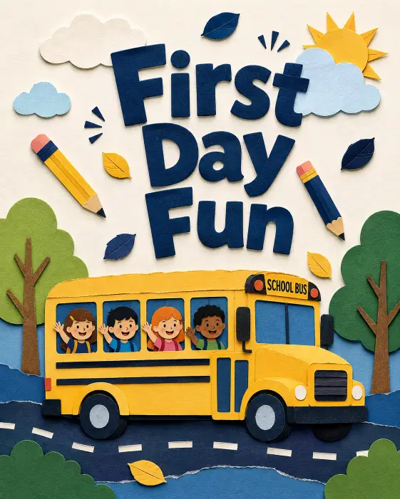
Paper collage style has a nice tactile look that photographs well when printed. Kids respond to it too.
Create a back to school poster in a cut paper collage style featuring a yellow school bus driving from left to right across the lower third of the design. Build the bus, road, trees, and clouds from layered construction paper shapes with visible torn edges and subtle drop shadows between layers. Above the bus, place bold rounded text that reads “First Day Fun” in deep navy. Add small paper cut leaves and pencils floating in the background. Straight on flat view with even, soft lighting that catches the paper texture. Use a palette of school bus yellow, navy blue, sky blue, and warm white. The mood should feel playful, crafty, and friendly. Use aspect ratio 4:5.
4. Watercolor First Day Sign
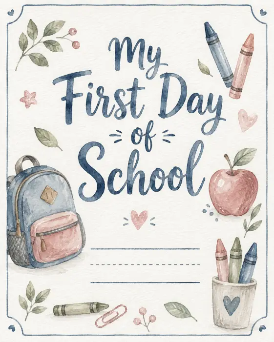
Parents love these for first day photos. It prints well on regular paper and still looks soft and expensive.
Create a watercolor back to school poster with a soft white paper background and visible paper grain. In the center, hand painted script text reads “My First Day of School” in dusty blue watercolor with natural bleed at the edges of the strokes. Below the text, leave a blank ruled line area for writing a name and grade. Surround the layout with loose watercolor illustrations of a backpack, crayons, an apple, and small leaves painted in muted tones. Frame the whole design with a thin hand drawn border. Even natural lighting, flat straight on view. Keep the palette to dusty blue, blush pink, sage, and warm gray. The overall feel should be gentle, handmade, and calm. Use aspect ratio 4:5.
5. Bold Typographic Classroom Poster
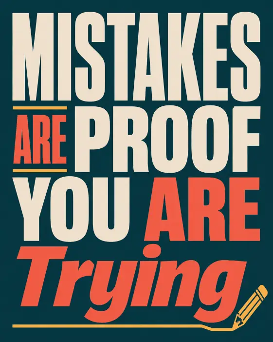
Sometimes the message is the design. This one is pure type and it reads clearly from across a room.
Create a bold typographic classroom poster with the phrase “Mistakes Are Proof You Are Trying” filling the entire frame. Stack the words in different sizes and weights so the layout builds a strong block of text, with “Mistakes” in a heavy condensed sans serif and “Trying” in a contrasting bold italic. Set the type in cream and bright coral against a deep teal background. Add a thin geometric line running under the last word and a small pencil icon in the bottom corner. Flat straight on composition with even lighting and crisp edges. Keep the palette to deep teal, cream, coral, and mustard. The style should feel modern, graphic, and confident. Use aspect ratio 4:5.
6. Vintage Travel Poster Style
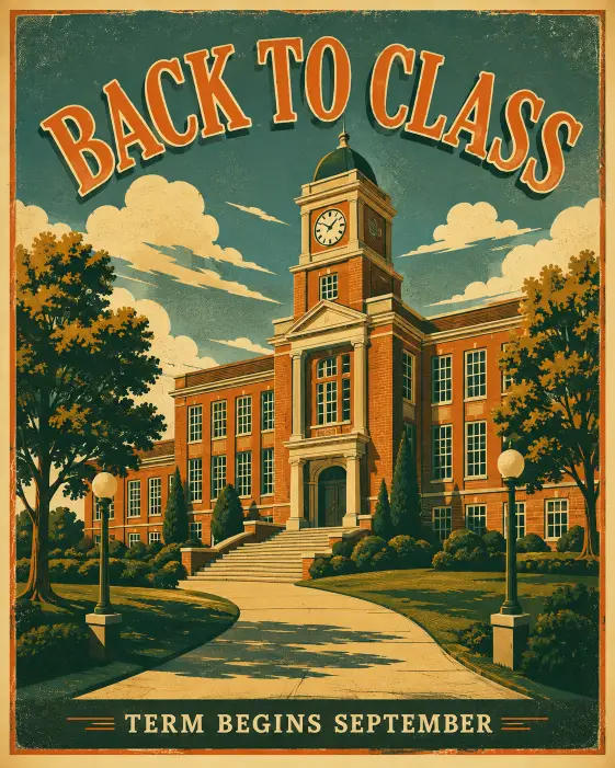
This one borrows the look of old railway posters. It works especially well for high school hallways and library walls.
Create a back to school poster in a 1950s vintage travel poster style showing a stylized school building with tall windows, a clock tower, and wide front steps. Frame the building from a low angle so it looks grand against a sky filled with flat stylized clouds. Add rows of trees and a winding path leading to the entrance. Place arched text at the top reading “Back to Class” and smaller text at the bottom reading “Term Begins September” in a classic serif. Use screen printed textures with slight ink misregistration and grain. Warm late afternoon light with long simple shadows. Keep the palette to burnt orange, cream, forest green, and dusty teal. Use aspect ratio 4:5.
7. Pastel Stationery Poster
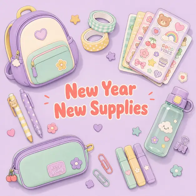
Soft pastel designs do well for younger classrooms and for shops selling school supplies.
Create a soft pastel back to school poster showing a neat arrangement of cute stationery items placed on a pale lavender background. Include a rounded backpack, a pencil case, a stack of sticker sheets, washi tape rolls, and a small water bottle, all drawn in a simple rounded illustration style with thick soft outlines. Arrange the items in a loose circle with open space in the middle. In that center space, add bubbly rounded text reading “New Year New Supplies” in soft coral. Flat overhead view with even soft lighting and gentle shadows under each item. Palette of lavender, mint, butter yellow, and soft coral. The mood should feel sweet, cheerful, and light. Use aspect ratio 1:1.
8. Reading Corner Library Poster
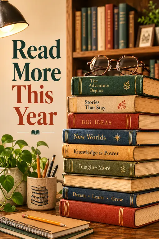
Perfect for a reading nook or a school library wall. The stacked books give it a clear focal point.
Create a back to school library poster showing a tall stack of hardcover books rising up the right side of the frame, with a pair of round glasses resting on top and a green plant beside the stack. Behind the books, sketch a warm wooden shelf with more spines lined up in soft focus. On the left side, place vertical text reading “Read More This Year” in a classic serif, running from top to bottom. Eye level view with a shallow sense of depth. Warm lamp lighting from the left casting soft shadows across the books. Use a palette of caramel brown, deep green, cream, and brick red. The style should feel cozy, editorial, and quiet. Use aspect ratio 4:5.
9. Science Classroom Poster
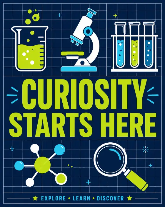
Subject specific posters are always in demand. This one suits a science lab or a middle school corridor.
Create a science themed back to school poster with a dark navy background and a clean flat illustration of laboratory items arranged in a grid. Include a beaker with bubbling liquid, a microscope, a test tube rack, a molecule diagram, and a magnifying glass, each drawn with simple shapes and bright accent colors. Draw thin white grid lines behind everything like graph paper. Across the middle, place bold uppercase text reading “Curiosity Starts Here” in bright lime. Straight on flat composition with even lighting and no harsh shadows. Palette of navy, lime green, cyan, and white. The look should feel sharp, modern, and educational. Use aspect ratio 4:5.
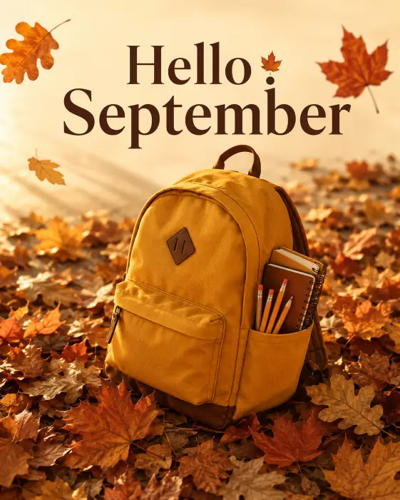
10. Autumn Backpack Poster
Back to school and autumn go together. This one leans into the seasonal colors.
Create an autumn themed back to school poster showing a mustard yellow backpack sitting on a pile of fallen leaves with a few pencils and a notebook tucked into the side pocket. Scatter oak and maple leaves across the lower half of the frame and let a few float in the upper corners. Slightly high camera angle looking down at the backpack. Warm golden hour lighting coming from the left with soft long shadows on the ground. At the top, add clean text reading “Hello September” in dark brown serif with a small leaf icon replacing the dot above the letter i. Use a palette of mustard, rust, deep brown, and warm cream. The mood should feel cozy and seasonal. Use aspect ratio 4:5.
11. Minimal Line Art Desk Poster
Clean and simple. This is the one to pick if the room already has a lot going on visually.
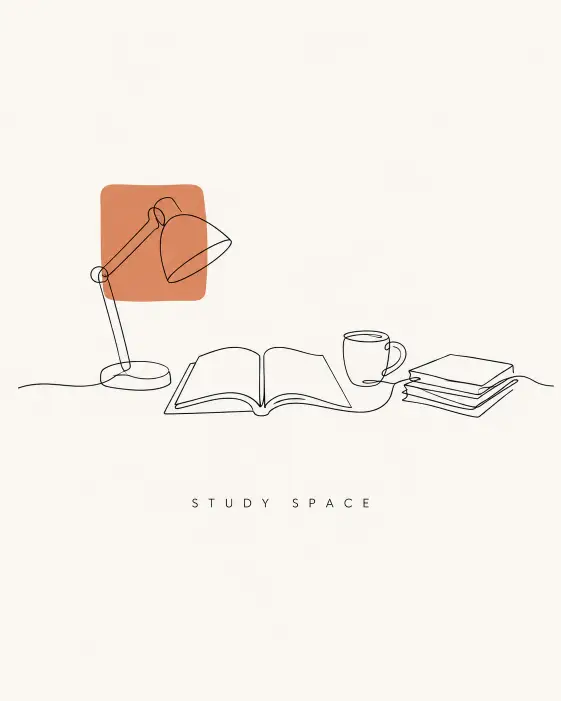
Create a minimal back to school poster with a single continuous line drawing of a study desk holding a lamp, an open book, a coffee mug, and a small stack of papers. Draw the entire scene in one thin black line on a plain off white background with plenty of empty space around it. Place small neat text below the drawing reading “Study Space” in a light sans serif with wide letter spacing. Straight on flat view with soft even lighting and no shadows. Keep the palette to black line work, off white background, and one small block of terracotta as an accent behind the lamp. The style should feel calm, modern, and minimal. Use aspect ratio 4:5.
12. Bold Hallway Poster for High School
High school hallways need something louder. This one uses strong contrast so it holds up from a distance.
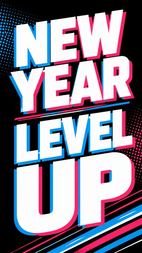
Create a high contrast back to school poster for a high school hallway with a black background and oversized text reading “New Year Level Up” filling most of the frame. Set the words in a heavy geometric sans serif with electric blue and hot pink layered slightly offset from each other for a printed misalignment effect. Add thin diagonal stripes running across the bottom corner and a small halftone dot pattern behind the type. Flat straight on composition with sharp crisp edges. Use a palette of black, electric blue, hot pink, and white. The style should feel bold, energetic, and graphic. Use aspect ratio 9:16.
13. Classroom Door Welcome Poster
A simple welcome poster for the door, with space to add a teacher name and room number.
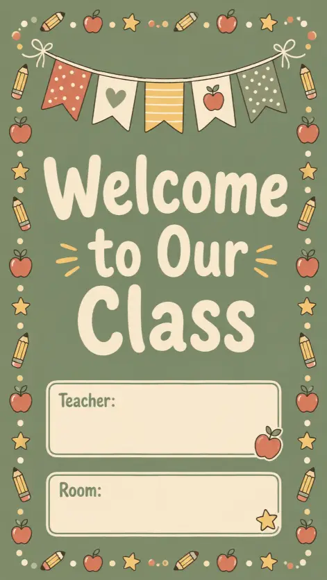
Create a friendly classroom door poster with a soft sage green background and a decorative border of small hand drawn pencils, apples, and stars running around all four edges. In the center, place large rounded text reading “Welcome to Our Class” in warm cream. Below it, leave two blank rectangular panels with thin outlines for writing a teacher name and room number. Add a simple illustration of a hanging paper banner across the top of the design. Flat straight on view with even soft lighting. Keep the palette to sage green, cream, terracotta, and soft yellow. The mood should feel warm, welcoming, and tidy. Use aspect ratio 9:16.
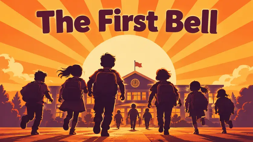
14. Playground Silhouette Poster
Silhouettes give you movement and energy in a poster without needing detailed figures.
Create a back to school poster showing dark silhouettes of children with backpacks walking and running across the bottom of the frame, shown from behind as they head toward a school building in the distance. Keep all figures as solid flat silhouettes with no visible detail. Behind them, place a large sun with flat radiating stripes filling the sky. Wide low angle view looking slightly upward. Warm morning backlight rimming the edges of the silhouettes. Add text along the upper third reading “The First Bell” in a rounded bold sans serif. Use a palette of warm orange, deep plum, gold, and cream. The style should feel graphic, hopeful, and poster like. Use aspect ratio 16:9.
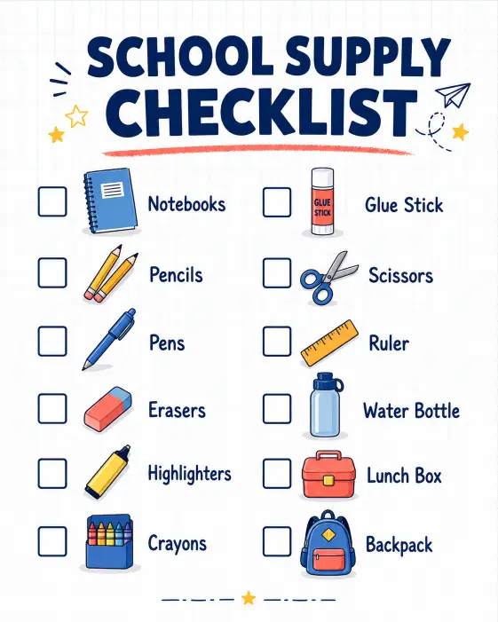
15. School Supply Checklist Poster
This one is practical. Parents actually pin it up, which makes it a good design for shops and school newsletters.
Create a back to school supply checklist poster with a clean white background and a light grid pattern behind the content. At the top, place bold text reading “School Supply Checklist” in navy. Below it, arrange two neat columns of checklist rows, each with an empty square checkbox, a small flat icon, and a short label such as notebooks, pencils, erasers, glue stick, scissors, water bottle, lunch box, and backpack. Keep spacing even and generous between rows. Flat straight on composition with soft even lighting and light shadows under the icons. Use a palette of navy, sky blue, coral, and white with soft yellow highlights. The style should feel clean, organized, and easy to read. Use aspect ratio 4:5.
These 15 prompts cover most of what a school year needs, from classroom doors to hallway walls to shop windows. Change the wording in any prompt to match your own school name, grade, or term dates and it will still hold together.
If a poster comes out close but not quite right, keep the same chat open and ask ChatGPT to adjust one thing at a time. Changing the background color or the text size usually works better than rewriting the whole prompt.
Try a few and see which style fits your space. I would love to know which one you end up printing.