21 ChatGPT Prompts for Graphic Design Using Images 2.0
OpenAI just dropped ChatGPT Images 2.0 on April 21, 2026, and it has changed what AI can actually do for graphic design. The new gpt-image-2 model finally renders text correctly with near 99% accuracy, handles complex layouts, and can think through a design before generating it.
What this means for designers, marketers, and solo creators is simple. You can now ask ChatGPT to make a real poster, an infographic, a logo concept, or a social media template, and the output will be usable instead of broken. Text comes out clean. Layouts hold together. Brand consistency works across multiple images.
To use these prompts, open ChatGPT, start a new chat, and select the image generation option.
Below are 21 prompts you can copy and paste straight into ChatGPT. Each one is detailed enough to get a strong first result, and you can tweak any of them to match your brand colors or content.
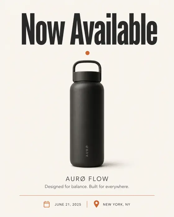
1. Minimalist Product Launch Poster
This one works great for launching a new app, gadget, or service. The clean layout puts the focus on a single hero element with strong typography.
Create a minimalist product launch poster with a single centered product silhouette on an off-white background. Place a bold sans-serif headline at the top reading “Now Available” in deep charcoal. Below the product, add a smaller subtitle in muted gray with the product name and tagline. Use a thin horizontal rule above the date and location at the bottom. Color palette is cream, charcoal, and a single accent color of burnt orange. Add a subtle drop shadow under the product for depth. Style is editorial, Scandinavian, gallery-print quality. Use aspect ratio 4:5.
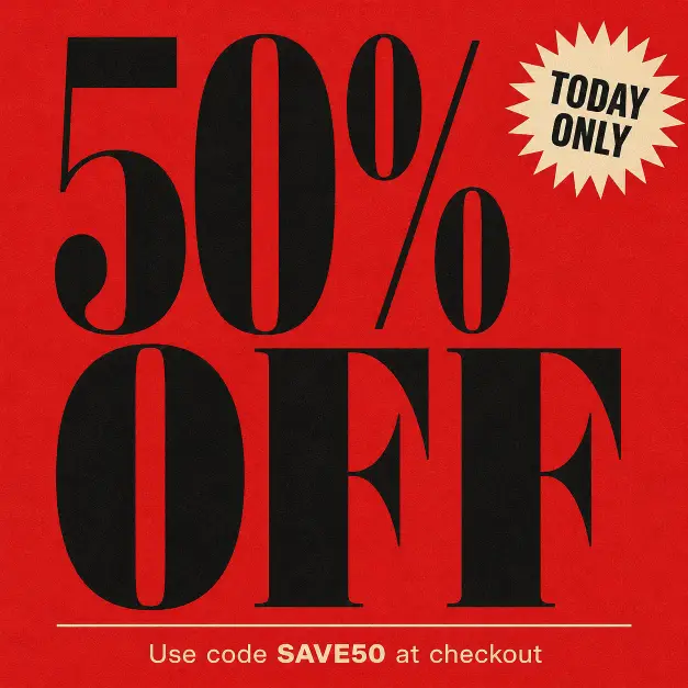
2. Bold Sale Banner for Social Media
Sale banners need to grab attention in a feed. This prompt builds a high-contrast layout that stops the scroll.
Create a bold sale banner with the words “50% OFF” in massive condensed black serif typography filling 70% of the frame. Stack the text on three lines with tight line spacing. Background is a saturated cherry red with subtle paper grain texture. Add a small starburst graphic in cream at the top right corner with the words “TODAY ONLY” inside it. At the bottom, place a thin cream-colored rule and a small line of text reading “Use code SAVE50 at checkout” in clean sans-serif. Style is retro department store advertising with a modern twist. Use aspect ratio 1:1.
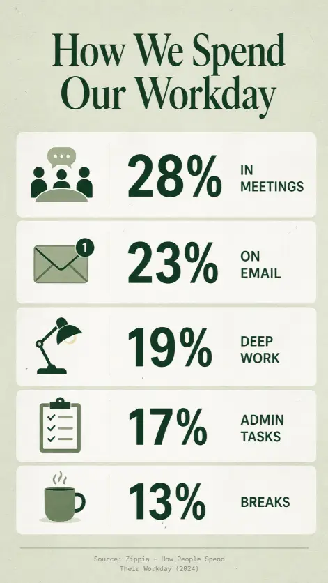
3. Clean Infographic on Productivity Stats
Infographics are where Images 2.0 really shines because of the text accuracy. This one keeps the data readable and the layout breathable.
Create a clean infographic titled “How We Spend Our Workday” with five horizontal stat blocks stacked vertically. Each block has a small flat-design icon on the left, a large percentage number in the center using bold sans-serif, and a short two-word label on the right. The five stats are: 28% in meetings, 23% on email, 19% deep work, 17% admin tasks, 13% breaks. Background is a soft sage green with white stat blocks and a subtle paper texture. Header at the top in dark forest green serif. Footer line at the bottom with a small source citation in light gray. Style is modern editorial infographic. Use aspect ratio 9:16.
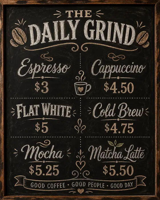
4. Vintage Coffee Shop Menu Board
Menu boards are a fun design exercise and a great way to test how well the model handles structured pricing layouts.
Create a vintage coffee shop menu board with a chalkboard-style background in deep matte black. Header at the top reads “THE DAILY GRIND” in hand-drawn chalk lettering with small coffee bean illustrations on either side. Below, list six drinks in two columns of three: Espresso $3, Cappuccino $4.50, Flat White $5, Cold Brew $4.75, Mocha $5.25, Matcha Latte $5.50. Use a mix of script and bold all-caps chalk fonts for variety. Add small decorative chalk doodles between sections like steam swirls and a tiny mug icon. Soft warm tones to mimic café interior glow. Style is hand-drawn, rustic, café signage aesthetic. Use aspect ratio 4:5.
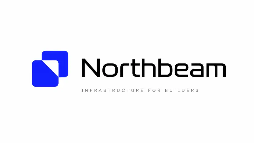
5. Modern Tech Startup Logo Concept
A simple, memorable logo concept on a clean canvas. Useful for brainstorming or showing a client a direction.
Create a modern tech startup logo concept centered on a pure white canvas. The logo combines a geometric mark on the left, made of two overlapping rounded squares forming a subtle abstract letter shape, with the wordmark “Northbeam” on the right in a custom-feeling sans-serif with slightly extended letterforms. The mark is in a deep electric blue and the wordmark is in matte black. Below the logo, place a thin tagline reading “Infrastructure for builders” in light gray small caps. Generous white space around the layout. Style is clean Silicon Valley brand identity, gallery presentation. Use aspect ratio 16:9.
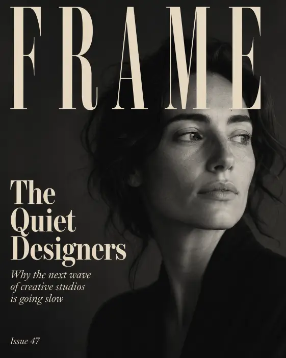
6. Editorial Magazine Cover
Magazine covers test composition, hierarchy, and headline rendering all at once. This prompt sets up a moody, design-forward cover.
Create an editorial magazine cover for a publication titled “FRAME” set in tall condensed serif at the top of the page in cream. The cover photo is a soft black and white portrait of a woman looking off to the side, taking up the full background with deep moody shadows. Overlay headlines on the left side in a vertical stack: a large feature title reading “The Quiet Designers” in bold cream serif, a smaller subtitle reading “Why the next wave of creative studios is going slow” in light italic serif, and a small issue number “Issue 47” in the bottom corner. Style is high-end editorial print magazine. Use aspect ratio 4:5.
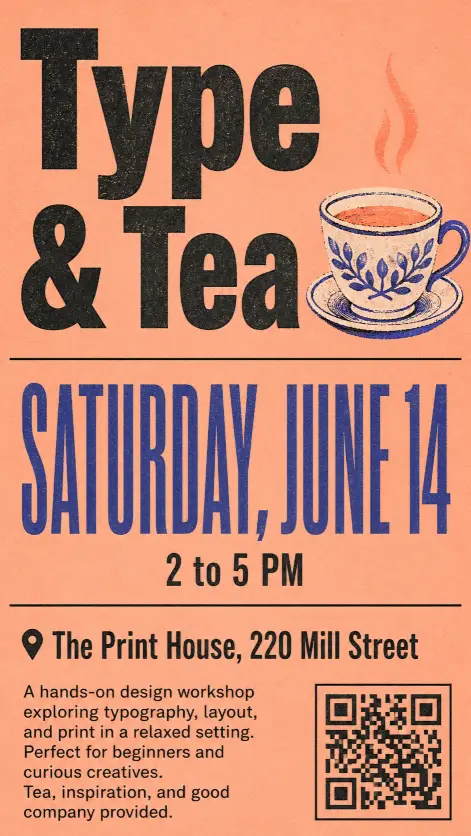
7. Event Flyer for a Local Workshop
Workshop flyers need clear info hierarchy. This layout keeps the date prominent and the details scannable.
Create an event flyer for a local design workshop. Top third features a large bold sans-serif title reading “Type & Tea” with a small illustrated teacup icon next to it. Middle third shows the date “Saturday, June 14” in oversized condensed display type, with the time “2 to 5 PM” directly below in smaller weight. Bottom third lists the location “The Print House, 220 Mill Street” and a short three-line description of what attendees will learn. Background is a warm muted peach with a single thin black rule dividing the sections. Add a small QR code in the bottom right corner. Style is modern risograph poster aesthetic. Use aspect ratio 9:16.
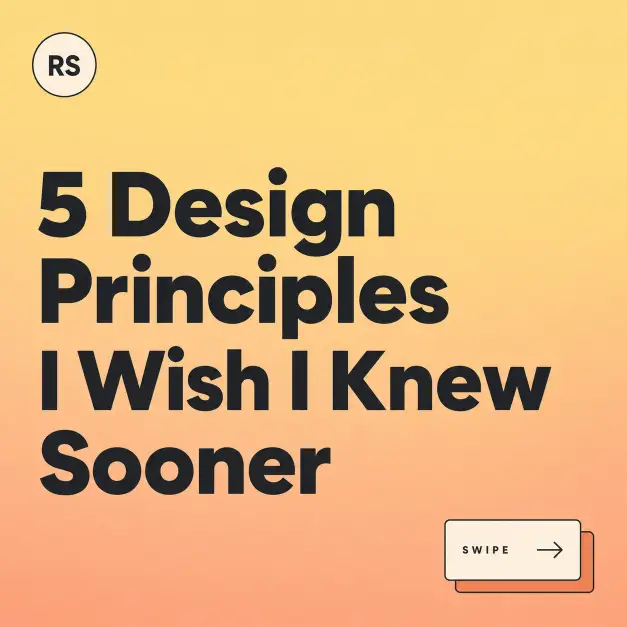
8. Instagram Carousel Cover Slide
Carousel covers are doing serious work on Instagram. This prompt makes a strong opener that signals there is more inside.
Create an Instagram carousel cover slide with the headline “5 Design Principles I Wish I Knew Sooner” set in a chunky modern sans-serif across three lines, left aligned. Background is a gradient from soft butter yellow at the top to warm peach at the bottom. In the bottom right corner, add a small visual cue showing two stacked rectangles with a right arrow icon and the text “Swipe” in small all-caps. In the top left corner, place a small circular author tag with placeholder initials “RS” inside. Style is friendly, modern, design educator aesthetic. Use aspect ratio 1:1.
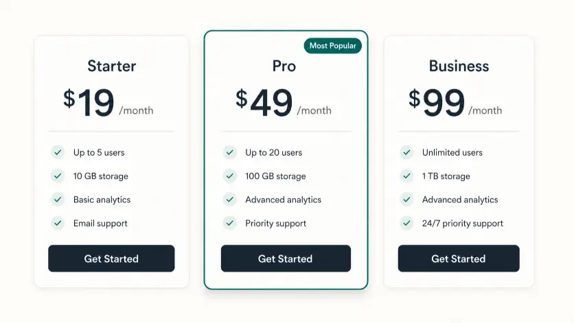
9. Pricing Table for a SaaS Landing Page
Pricing tables are notoriously hard for older image models. Images 2.0 handles them cleanly because the text actually works.
Create a SaaS pricing table with three side-by-side plan cards on a soft off-white background. Each card has a plan name at the top, a large monthly price below, a thin divider, and a list of four feature bullets. The three plans are: Starter at $19 per month, Pro at $49 per month with a small “Most Popular” badge in the top corner, and Business at $99 per month. The Pro card has a slightly raised drop shadow and a subtle accent border in deep teal. Each card ends with a rounded button at the bottom reading “Get Started” in white on a dark button. Style is modern SaaS landing page UI design. Use aspect ratio 16:9.
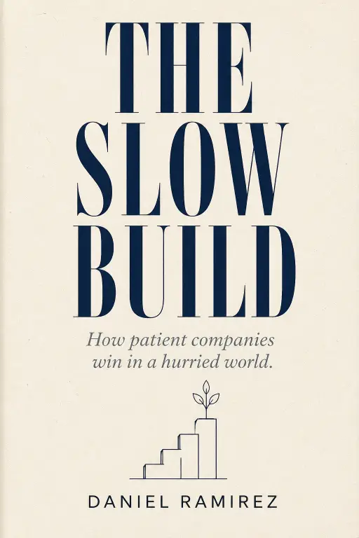
10. Book Cover Concept for a Nonfiction Title
Book covers are pure typography and concept. This prompt focuses on a strong title-and-subtitle hierarchy.
Create a book cover concept for a nonfiction title called “The Slow Build” with the subtitle “How patient companies win in a hurried world.” The title is set in large condensed serif type filling the upper half of the cover in deep navy. The subtitle sits in smaller italic serif below in muted slate. Author name reads “Daniel Ramirez” in clean sans-serif at the bottom. Background is a textured cream paper with a single small geometric line illustration in the center showing a slow-growing plant or upward staircase. Style is premium nonfiction hardcover, Penguin Press aesthetic. Use aspect ratio 2:3.
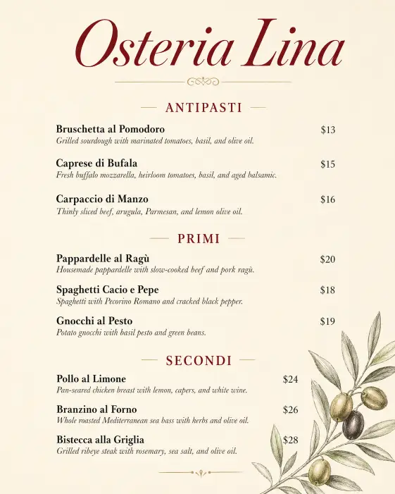
11. Restaurant Menu Card
A clean dinner menu card that you could actually print and put on a table. Tests both layout and food typography.
Create a restaurant menu card for an Italian bistro called “Osteria Lina” with the restaurant name in elegant italic serif at the top in deep wine red. Below, organize the menu into three sections labeled Antipasti, Primi, and Secondi. Each section has three dishes with a name in bold serif, a one-line description in light italic, and a price aligned to the right. Use generous spacing between items. The background is warm ivory with a subtle hand-drawn olive branch illustration in the bottom corner. Style is upscale neighborhood Italian restaurant. Use aspect ratio 4:5.
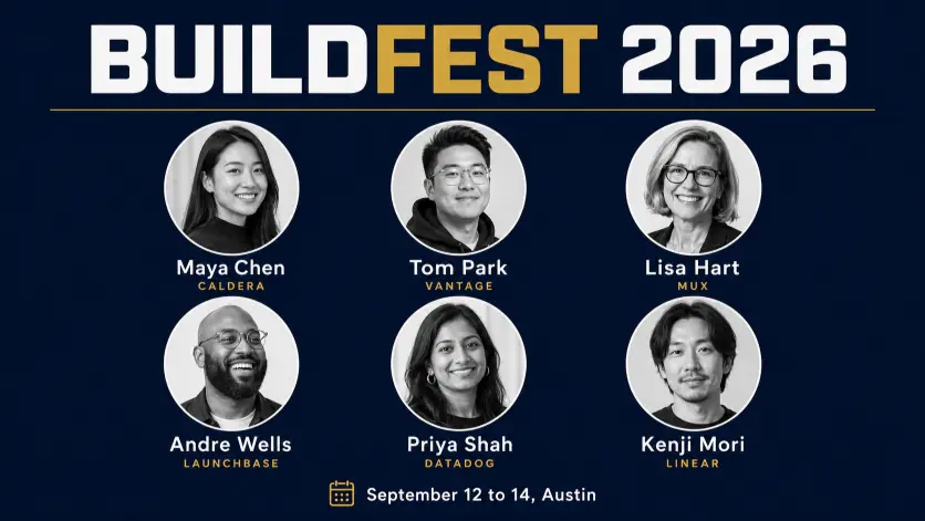
12. Conference Speaker Lineup Graphic
Speaker lineups need to fit a lot of info without feeling cluttered. This grid layout handles that well.
Create a conference speaker lineup graphic with the event name “BUILDFEST 2026” in bold display sans-serif across the top. Below, arrange a 3 by 2 grid of six circular speaker portraits in black and white, each with the speaker name in clean sans-serif beneath the circle and their company in small caps below the name. Use placeholder names like “Maya Chen,” “Tom Park,” “Lisa Hart,” “Andre Wells,” “Priya Shah,” and “Kenji Mori.” Background is a deep navy with a thin gold horizontal rule separating the title from the grid. Add the event date “September 12 to 14, Austin” at the very bottom. Style is modern tech conference branding. Use aspect ratio 16:9.
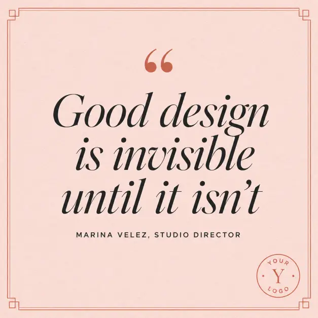
13. Quote Graphic for a Brand Account
Quote graphics are bread and butter for brand social. This one stays clean and very on-brand.
Create a quote graphic with the quote “Good design is invisible until it isn’t” set in large italic serif type centered on the canvas. Add small decorative quotation marks in a contrasting color above the quote. Below the quote, in smaller all-caps sans-serif, place the attribution “Marina Velez, Studio Director.” Background is a soft blush pink with a subtle paper grain texture. Add a thin geometric border around the entire layout in a muted terracotta. In the bottom right corner, place a small circular brand logo placeholder. Style is modern brand-led social content. Use aspect ratio 1:1.
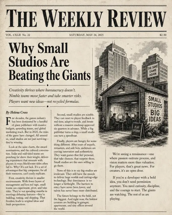
14. Newspaper-Style Editorial Layout
Newspapers have a very specific visual rhythm. This is a fun one to test the model on serious typography.
Create a newspaper-style editorial layout with a masthead at the top reading “THE WEEKLY REVIEW” in heavy black serif. Below, set a multi-column article layout with a large feature headline reading “Why Small Studios Are Beating the Giants” in bold serif, a deck of three smaller subheads, and three columns of placeholder body text in classic newspaper serif. Add a small black and white illustration on the right side wrapping into the columns. Include a byline reading “By Helena Cross” in italic. Background is aged off-white newsprint paper with subtle texture. Style is classic broadsheet newspaper. Use aspect ratio 4:5.
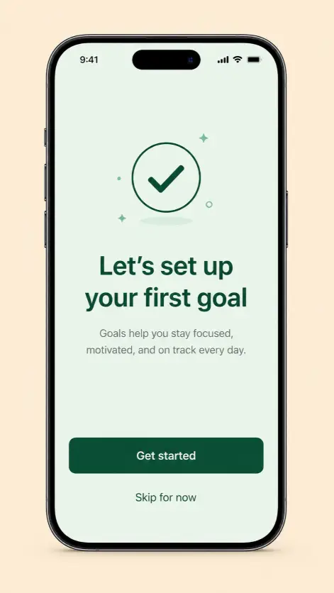
15. App Onboarding Screen Mockup
App mockups are useful for pitching, portfolios, or design exercises. This prompt sets up a clean phone screen layout.
Create an app onboarding screen mockup shown inside a modern smartphone frame. The screen background is a soft mint green. At the top of the screen is a small minimal illustration of a checkmark inside a circle in dark green. Below, set a headline reading “Let’s set up your first goal” in bold sans-serif, followed by a short two-line description in lighter weight gray. At the bottom, place a primary button in deep green reading “Get started” in white sans-serif, and below it a small text link reading “Skip for now.” Background outside the phone is a flat warm beige. Style is modern mobile UI design portfolio. Use aspect ratio 9:16.
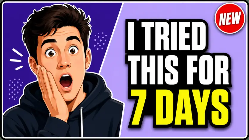
16. YouTube Thumbnail for a Tutorial Video
Thumbnails decide whether someone clicks or scrolls past. This layout balances a bold expression with clean text that reads even on a phone screen.
Create a YouTube thumbnail for a design tutorial video. Left half features a stylized illustration of a person with an exaggerated surprised expression, eyes wide and one hand on their cheek, in a flat modern illustration style. Right half has a bold blocky headline reading “I Tried This for 7 Days” stacked on three lines in heavy condensed sans-serif, with the words “7 Days” highlighted in bright yellow. Background is split diagonally with a deep purple on the left and a softer lavender on the right. Add a small red circular badge in the top right corner reading “NEW” in white. Include a thin white outline around the entire layout for separation. Style is modern YouTube creator thumbnail, high-contrast and clickable. Use aspect ratio 16:9.
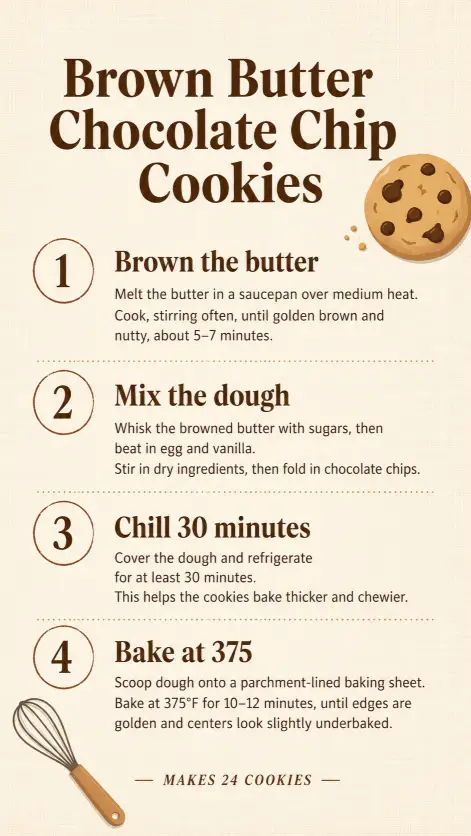
17. Step-by-Step Recipe Graphic
Recipe graphics need both visual flow and readable type. This vertical layout works well for Pinterest and Instagram.
Create a step-by-step recipe graphic titled “Brown Butter Chocolate Chip Cookies” with the title in warm brown bold serif at the top. Below, lay out four numbered steps in a vertical stack, each with a small circled number on the left, a bold step heading, and two lines of instruction text. The four steps are: Brown the butter, Mix the dough, Chill 30 minutes, Bake at 375. Background is a warm cream with a subtle linen texture. Add a small flat-design cookie illustration in the top right corner and a small whisk icon in the bottom left. Footer reads “Makes 24 cookies” in italic small caps. Style is modern food blog graphic. Use aspect ratio 9:16.
18. Brand Mood Board Layout
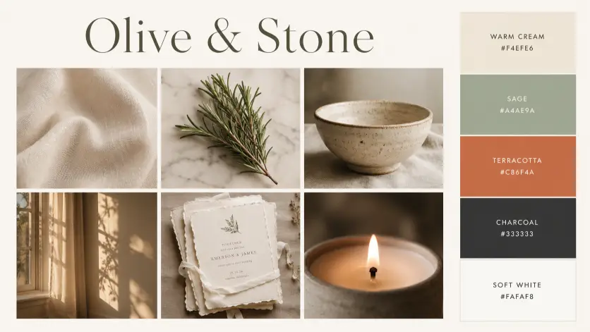
Mood boards are how designers communicate direction. This one shows the model can handle multi-image grid composition.
Create a brand mood board layout with the brand name “Olive & Stone” at the top in elegant serif. Below, arrange a six-panel grid: top row has three squares showing a cream linen fabric texture, a sprig of fresh rosemary on a marble surface, and a hand-thrown ceramic bowl. Bottom row shows three more squares with warm afternoon light through a window, a stack of unbleached paper invitations, and a close-up of a candle flame. To the right of the grid, place a vertical color palette strip with five swatches labeled with hex codes: warm cream, sage, terracotta, charcoal, and soft white. Background of the full layout is a soft off-white. Style is wedding stationery brand mood board. Use aspect ratio 16:9.
19. Podcast Episode Cover
Podcast covers need to work tiny in a feed but still feel rich. This prompt builds a strong identity for a single episode.
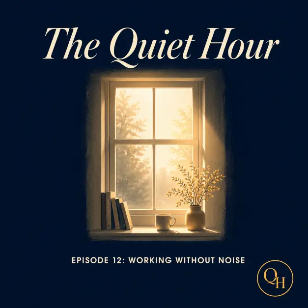
Create a podcast episode cover for a show called “The Quiet Hour.” The main visual is a stylized illustration of a single window with soft morning light coming through, set against a deep navy background. The show title appears at the top in cream italic serif. Below the illustration, in smaller bold sans-serif, set the episode title “Episode 12: Working Without Noise.” Add a small “QH” monogram in a circle at the bottom corner. Color palette is deep navy, cream, and a single warm gold accent. Add a soft glow effect on the illustrated window. Style is contemplative, slow-living podcast brand. Use aspect ratio 1:1.
20. Annual Report Cover Page
Annual report covers need to feel serious and intentional. This prompt sets up a corporate but design-forward layout.
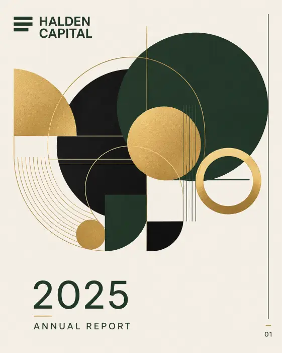
Create an annual report cover page for a company called “Halden Capital” with the year “2025 Annual Report” set in the bottom third in clean sans-serif. The top two-thirds of the page features a large abstract geometric composition made of overlapping circles and lines in deep forest green, gold, and matte black on a warm bone background. The company name appears in the top left in bold sans-serif, with a small horizontal logo mark next to it. Add a thin vertical rule on the right edge with a small page indicator at the bottom. Style is premium corporate design, investor report aesthetic. Use aspect ratio 4:5.
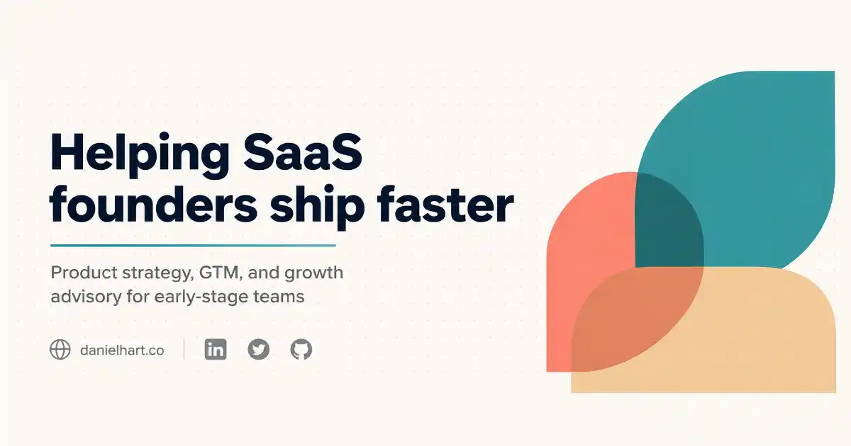
21. LinkedIn Banner for a Personal Brand
LinkedIn banners are prime real estate that most people waste. This one builds a clean professional banner that signals what you actually do.
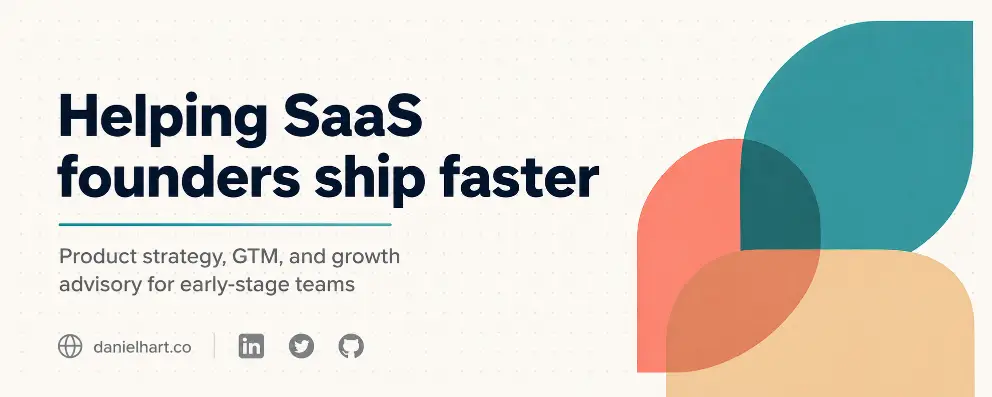
Create a LinkedIn banner for a personal brand with the headline “Helping SaaS founders ship faster” set in bold sans-serif on the left side in dark navy. Below the headline, add a smaller two-line subtitle reading “Product strategy, GTM, and growth advisory for early-stage teams” in medium gray. On the right side, place a clean abstract geometric composition of three overlapping rounded shapes in shades of teal, soft coral, and warm beige. Background is a soft off-white with a subtle dotted grid pattern. In the bottom left corner, add a small website link “danielhart.co” and three small social icons in muted gray. Add a thin horizontal accent line in teal under the headline. Style is modern personal brand, advisor and consultant aesthetic. Use aspect ratio 4:1.
A Few Tips for Getting the Best Results
The biggest unlock with Images 2.0 is text accuracy, so be very specific about the words you want on the design. Type them exactly as they should appear, including punctuation and capitalization. The model now handles long text and small type sizes much better than older versions.
For complex layouts like infographics, pricing tables, and magazine covers, turn on thinking mode if you have access to it. The reasoning step is what stops the layout from collapsing or text from getting jumbled.
If you want a series of related designs that share a visual identity, use the multi-image generation feature in thinking mode. You can ask for up to eight coherent variations from a single prompt, and the brand consistency stays intact across them. That alone is a huge time-saver if you are putting together a full social media drop or a presentation deck.