One Gemini Prompt That Makes Vintage Travel Posters for Any City

Get our stories first in Google Search
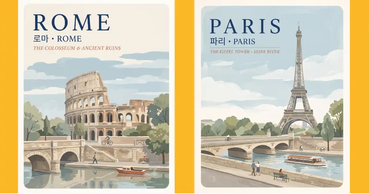
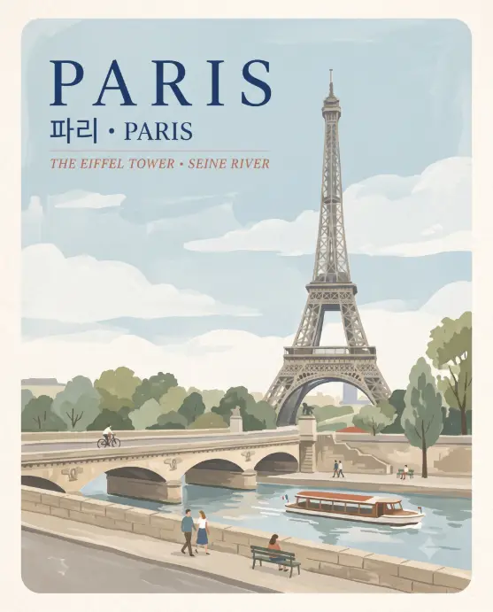
There’s a style of travel poster going around right now that looks like it was painted by hand in the 1950s. Soft washes of color, a pale blue sky, a famous landmark, and a few tiny people walking along a river.
I wanted a way to make these without rewriting the prompt every time, so I built one template where the only thing you touch is the city name.
Paris, London, Amsterdam, Kyoto, Lisbon. Same prompt, one word changed, and Gemini figures out the landmarks on its own.
Why Gemini Handles This Style Better
I tested this template across a few tools and Gemini gave me the cleanest results by a wide margin. The painted texture holds together, the palette stays muted, and the text block in the top corner comes out readable far more often.
To use it, go to gemini.google.com or open the Gemini app, start a new conversation, and select any model from the model options. That gives you Nano Banana, which is the model doing the heavy lifting here. Paste the prompt and send it. No reference image needed.
Why This Style Looks So Good
The whole thing works because of restraint. There are maybe five colors in the entire poster: cream, dusty blue, sage green, warm beige, and one terracotta accent that usually shows up as a rooftop or an awning. The people are painted without faces and the clouds are flat shapes.
Nothing is trying to look like a photograph, and that’s why it feels like a printed poster instead of an AI image. The other half is the text block: big city name, a smaller bilingual line, then an italic subtitle naming the landmarks.
The Prompt
Copy this into Gemini and change only the capitalized city name at the start. Leave the rest untouched.
Create a vintage-style travel poster illustration of [PARIS] in a soft hand-painted gouache and watercolor style. The poster is vertical with gently rounded corners and a light textured paper grain across the whole surface. In the top left corner, place the city name in large widely spaced serif capital letters in deep navy blue. Directly beneath it, add a smaller line showing the city name written in Korean Hangul, followed by a small centered dot and the city name in English. Below that line, add a short italic serif subtitle naming the two most recognizable landmarks or features of that city, written in muted terracotta. The main painted scene fills the lower two thirds of the poster and shows the city’s most famous landmark standing tall against a pale blue sky with soft flat cloud shapes. Build the foreground at street level with a stone bridge or waterfront walkway, calm reflective water, layered trees in sage and olive green, and three or four small stylized people walking, cycling, or sitting, painted without facial detail. Include one local transport detail such as a boat, tram, bus, or bicycle in a warm accent color. The camera view is eye level and slightly wide, like a painted postcard scene. Lighting is soft diffused daylight with no harsh shadows and no strong contrast. Keep the color palette muted and airy: cream, dusty blue, sage green, warm beige, and a single terracotta accent. Use aspect ratio 4:5.
Change the City
Replace PARIS with any city in capital letters and send it. The prompt never names the Eiffel Tower or the Seine, which is the point. Gemini already knows what Paris looks like, and it knows what Hanoi and Prague look like too.
That’s also why the subtitle line works. Asking for “the two most recognizable landmarks or features” gets you Big Ben and the Thames for London, canals and bicycles for Amsterdam, and something sensible for cities you’ve never visited.
Following are some other examples.
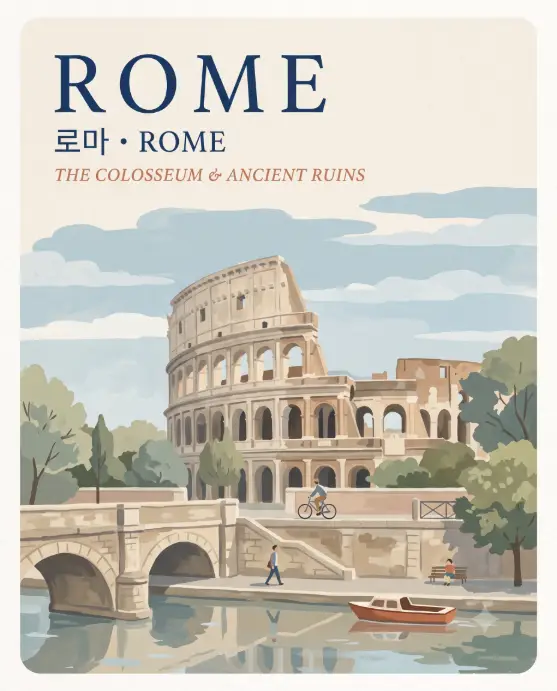
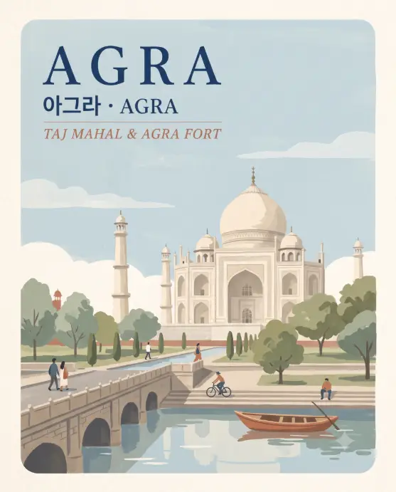
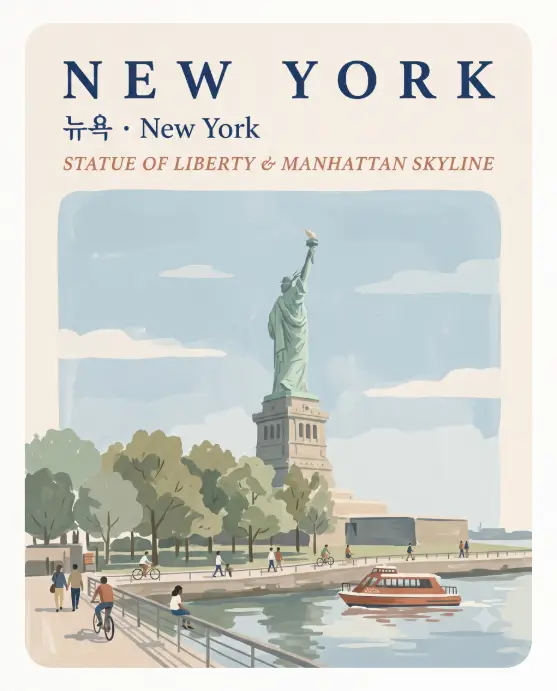
Gett the Text Right
Text is still the weakest part of any image model, so expect to run the prompt twice before the spelling is clean. The Korean line is usually the first thing to break.
If a poster comes out with a garbled word, start a fresh conversation and paste the prompt again rather than asking Gemini to fix it. Editing text inside an already generated image tends to shift the whole layout.
You can also swap Korean for any other script. Change the words “Korean Hangul” to Japanese, Hindi, Arabic, or Thai and the layout stays identical.
Cities That Work Especially Well
Anything with water in it gives you the strongest result, because the reflection in the foreground is doing a lot of the visual work. Venice, Copenhagen, Stockholm, Bruges, Porto, and Budapest all come out beautifully.
Cities built around one tall landmark are the second best group. Barcelona, Pisa, Seattle, Kuala Lumpur, and Agra all use the vertical shape well. Flat sprawling cities are harder, and if the result feels empty, add one line asking for a street scene instead of a skyline.
Small Changes Worth Trying
Once you have a version you like, try swapping the season. Adding “in autumn with warm ochre and rust foliage” or “in winter with soft snow on the rooftops” changes the mood while keeping the layout. Aspect ratio 9:16 gives you a story-sized version and 1:1 crops it tighter for a feed post.
You can also build a matching set by running four cities in the same conversation with every other word identical. Gemini holds the style well across a thread, which is what makes them look like a real series.
The reason this template holds up is that it describes a style, not a place. The city name is the only variable and Gemini handles the rest. Make one for a city you love, one for a city you want to visit, and one for the city you live in. They look genuinely good printed at A4.